9 Interior Design Rules Most People Break Without Even Knowing It
Most people think decorating a room is just about picking things they like and finding a place to put them.
And honestly that works fine until the room starts feeling off in a way that is hard to explain, like everything is technically fine but something is just not landing.
The frustrating part is that a lot of these issues come from habits that feel totally logical, matching the metals, keeping everything light, playing it safe with a neutral rug, all the things that sound like the right call.
A few small shifts in how people approach these decisions can change the whole feeling of a room without buying a single new thing.
These are the interior design rules most people break without realizing it, and the fixes are a lot simpler than expected.
1- Matching All Your Furniture and Finishes
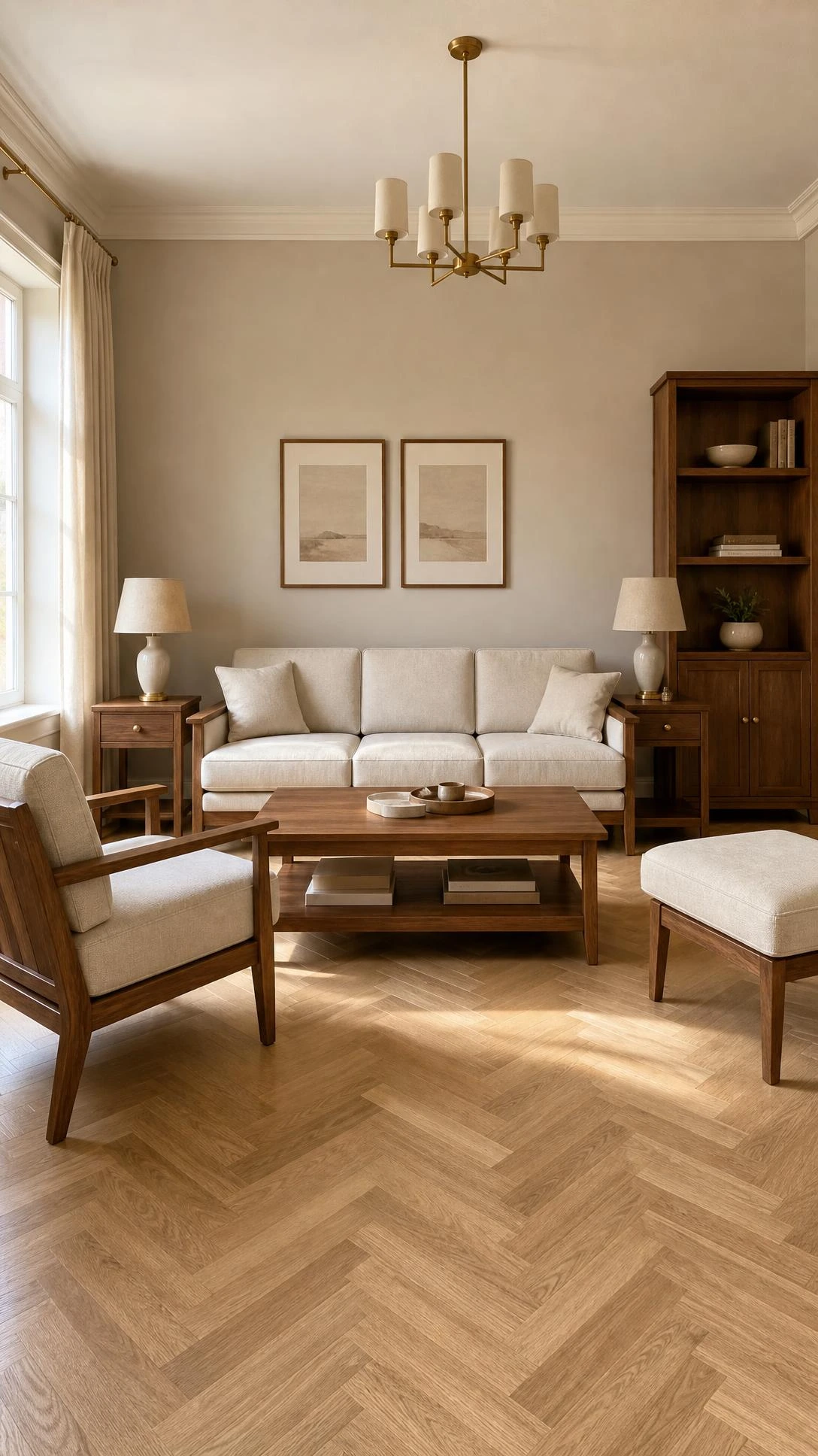
The matching furniture set is one of those things that feels like the safe and sensible choice, and it almost always makes a room feel flat.
When every piece in a room comes from the same collection or the same era, the space ends up looking more like a showroom floor than somewhere a real person lives.
Mixing a vintage wood dresser with a more modern bed frame, or pairing a linen sofa with a leather accent chair, adds the kind of visual tension that actually makes a room interesting.
A good starting point is keeping one anchor piece, like a sofa or a bed, consistent and letting everything else have a little more personality around it.
The goal is just to make it feel collected over time rather than purchased all at once.
2- Using White Paint on Every Single Wall
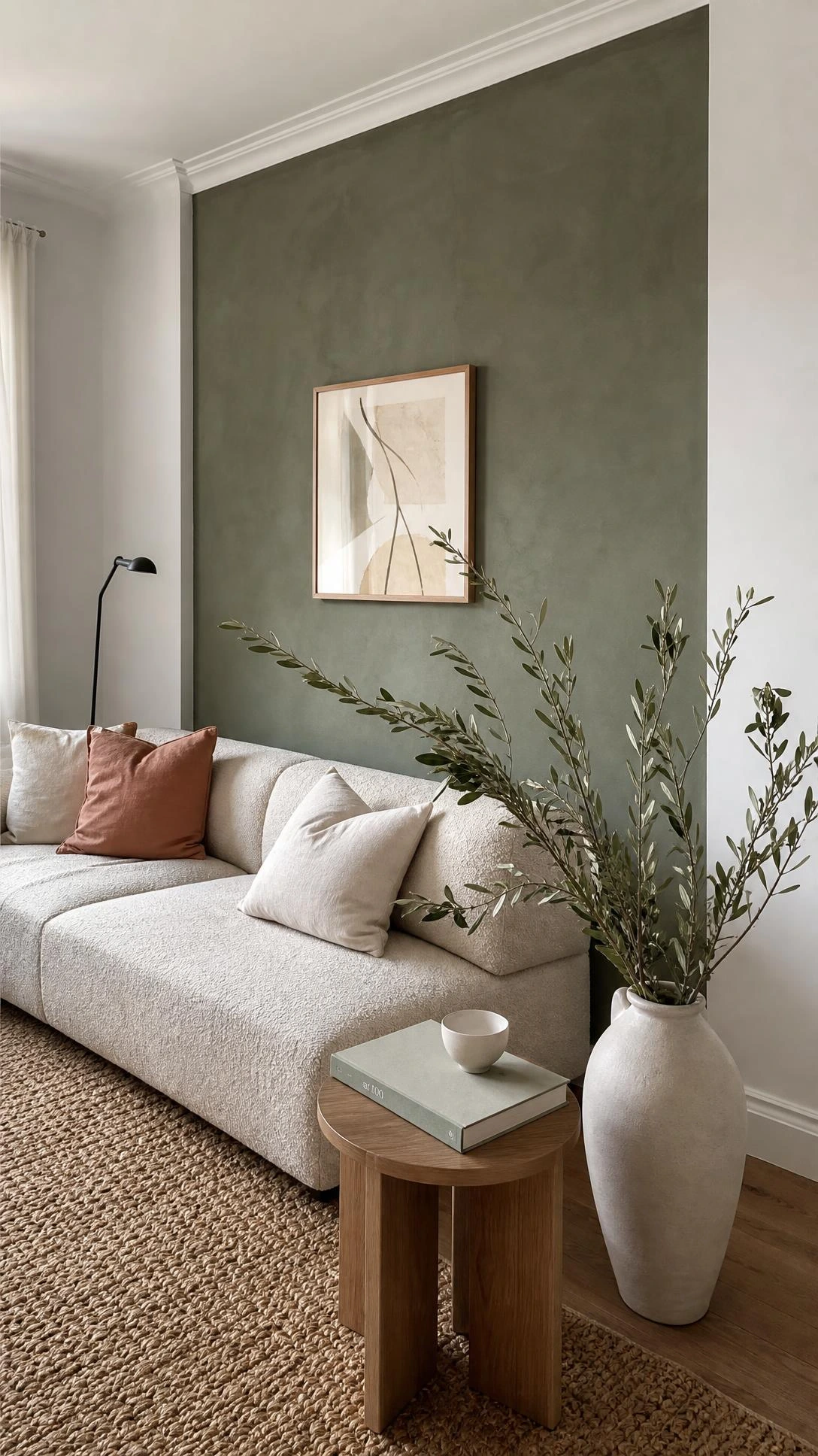
White walls became the default somewhere along the way and now it is the automatic choice even in rooms where it makes no sense.
The problem is that white reads differently in every room depending on the light, and in north-facing rooms especially it can end up looking cold, flat, and a little sad.
Something like a warm sandy terracotta, a dusty sage, or a sun-washed yellow can do a much better job of making a room feel livable and full of light without feeling heavy.
Benjamin Moore’s Pale Oak or Sherwin-Williams’ Accessible Beige are both examples of warm neutrals that feel like white but actually have enough depth to work with natural light.
White is not wrong, but it is worth asking whether it is actually the best choice for the specific room rather than just the easiest one.
3- Only Hanging Art Dead Center on the Wall
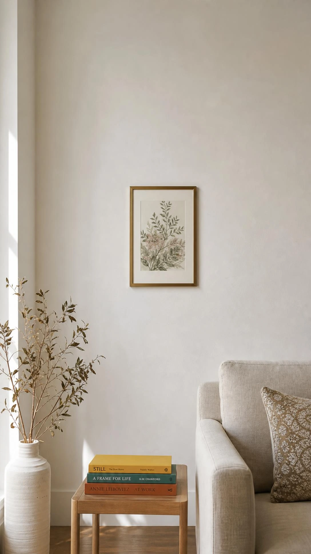
Most people hang everything at the same eye-level height across the whole house, which sounds like it should work but ends up feeling a little corporate after a while.
Art does not need to be hung at all to look good, and leaning a framed print against the wall on a bookshelf, a mantel, or a dresser gives a room a much more relaxed and personal feeling.
Mixing how art is displayed, some hung, some leaned, some stacked in a small cluster, keeps the eye moving around the room in a way that feels natural rather than arranged.
A simple swap like leaning a larger 24×36 inch frame on a sideboard instead of hanging it can make the whole room feel less formal almost immediately.
I think this is one of the easiest rules to break because it requires absolutely zero hardware and no commitment.
4- Keeping Small Rooms Light to Make Them Feel Bigger
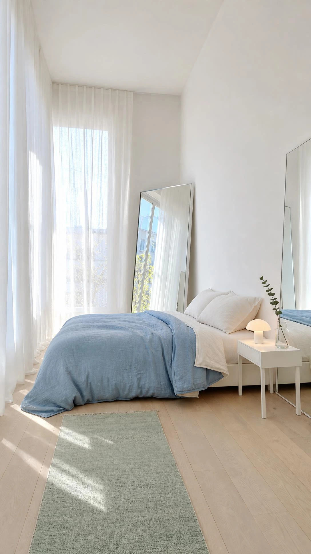
The idea that small rooms need light colors to feel bigger is one of the most repeated pieces of design advice out there, and it is only partially true.
A small room painted in a deep color like navy, forest green, or charcoal can actually feel more expansive because the walls seem to recede rather than close in.
What light colors actually do is make the boundaries of a room more obvious, while a dark color blurs where the walls start and stop.
A small bedroom painted in Farrow and Ball’s Hague Blue, for example, consistently looks far more dramatic and spacious in real life than the same room in a pale gray.
The key is committing to the color fully, including the trim, which keeps the eye from bouncing around and makes the whole room feel intentional.
5- Painting the Ceiling Flat White Every Time
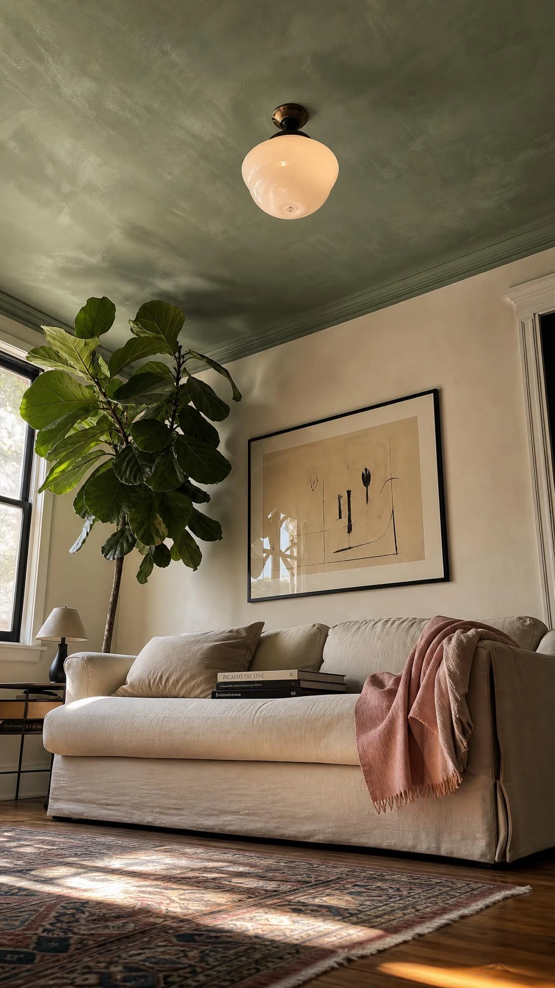
Ceilings are the one surface in a room that almost nobody thinks about until they are standing in someone else’s house and notice how good theirs looks.
A ceiling painted the same color as the walls, just a shade or two lighter, creates a wrapped feeling that makes a room feel taller and more complete.
Going bolder with ceiling treatment, like adding a subtle pattern, a metallic wallpaper, or a deep moody color, completely changes the proportions of a room in a way that feels almost architectural.
Even just painting the ceiling the same color as the walls in a room with eight-foot ceilings, instead of white, makes the space feel taller because there is no hard visual stop at the top.
Most people skip this because it sounds like a lot of effort, but a ceiling is actually one of the fastest surfaces to paint since there is no furniture or trim to work around.
6- Only Using Matching Metals Throughout a Room
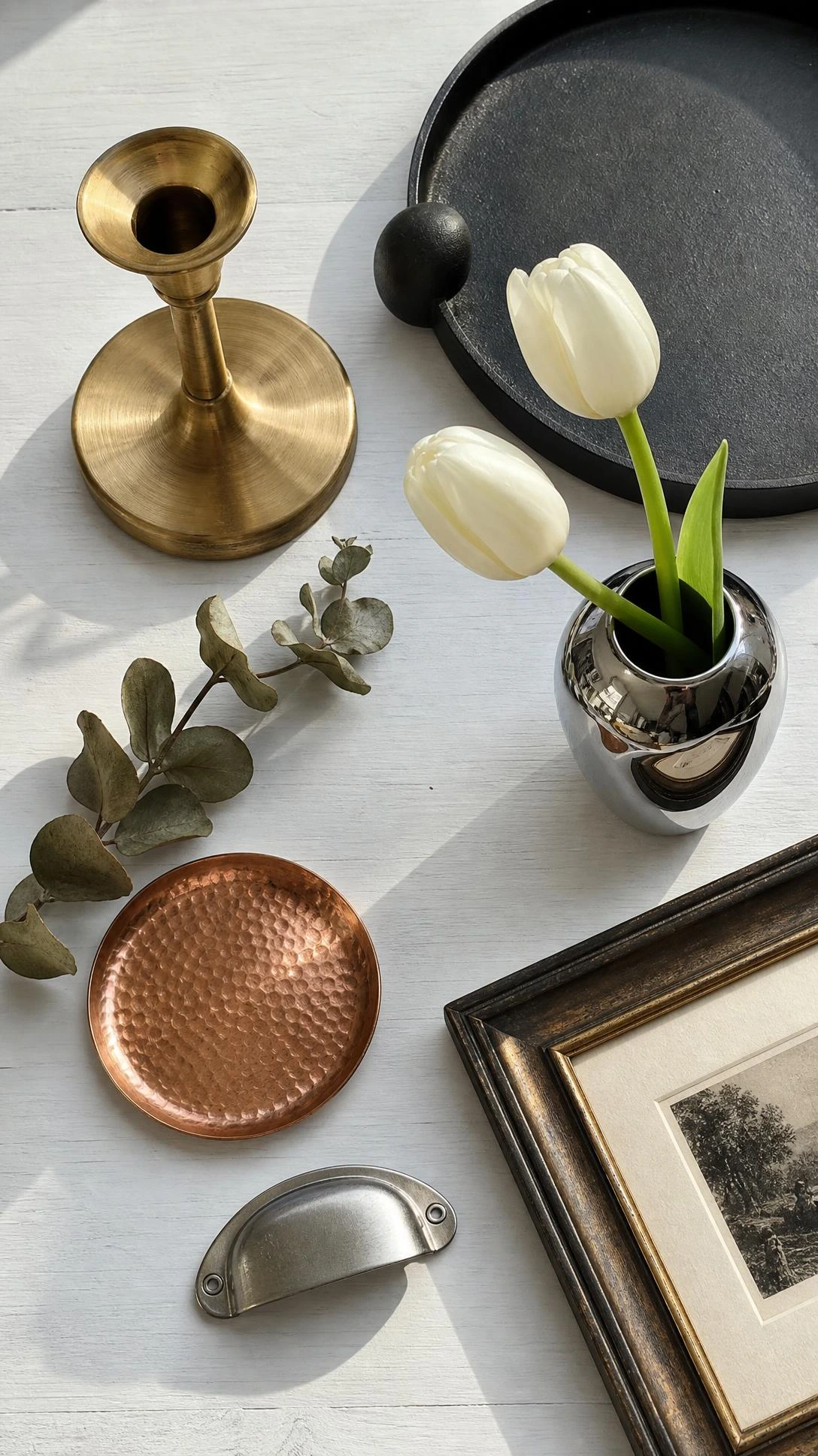
Matching all the metals in a room, every faucet, every light fixture, every cabinet pull all in the same brass or all in the same chrome, is one of those rules that sounds correct but works against a room’s depth.
Mixing metals like brushed nickel, warm brass, bronze, and matte black creates a layered and considered look that feels like it came together naturally rather than from a single shopping cart.
The trick is to pick one metal as the dominant finish and let one or two others appear as accents, so it feels intentional rather than mismatched.
A bathroom with polished chrome faucets, brass mirror hardware, and a matte black towel bar actually reads more cohesive than one where every single element is the same finish.
Mixing metals has been a standard move in high-end interior design for years and it is one of the easiest things to pull off at home with no budget required.
7- Playing It Safe With a Neutral Patterned Rug
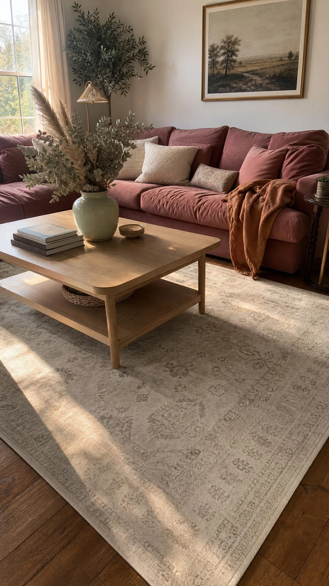
The beige jute rug or the gray geometric pattern is the rug equivalent of white walls, always fine, never wrong, and almost never memorable.
A rug is actually one of the lowest-commitment ways to add color and pattern to a room because it can be rolled up and swapped out if it stops working.
A deep jewel-toned rug in burgundy, cobalt, or hunter green can ground a neutral room and give it the one element that makes the whole space feel finished and deliberate.
People are often surprised that a bold rug actually makes a room feel calmer rather than busier, because it gives the eye somewhere to rest instead of scanning a room full of small competing details.
Going up in size also helps, a rug that is too small floats awkwardly in the middle of the room, while a 9×12 that fits under all the furniture legs pulls everything together.
8- Keeping Art Strictly on the Walls
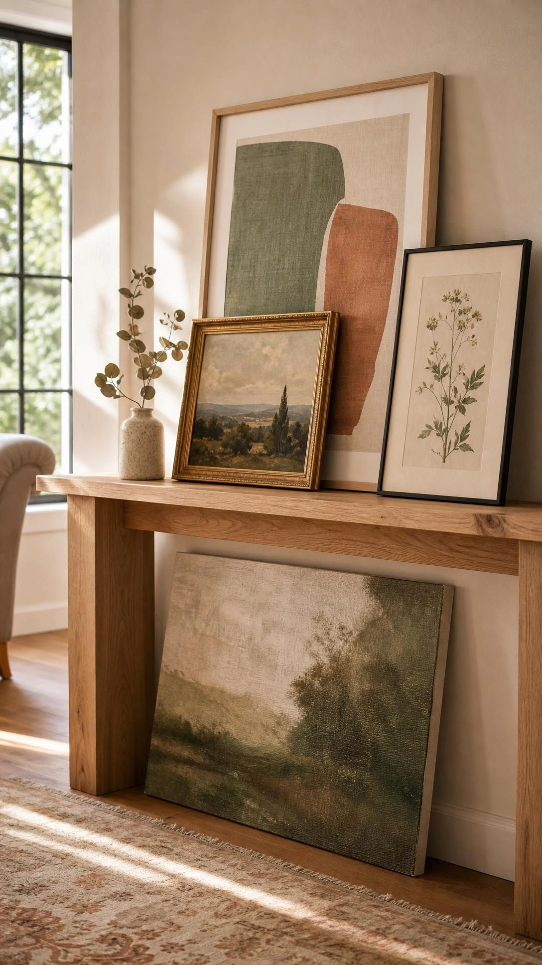
There is an unspoken rule that art belongs on the wall and nowhere else, and it is one of the easiest ones to quietly ignore.
Styling art on top of a stack of books, resting a small framed print inside a display shelf, or leaning a canvas on a windowsill adds warmth to corners and surfaces that would otherwise feel empty or staged.
It also makes a room feel like someone actually lives in it and cares about it, which is the whole point of decorating in the first place.
A simple 5×7 print in a nice frame sitting on a nightstand or a kitchen shelf does more visual work than people expect from something that small.
Once someone starts paying attention to flat surfaces as display opportunities rather than just storage areas, rooms start feeling much more layered and lived-in.
9- Sticking to Real Plants Only Outdoors
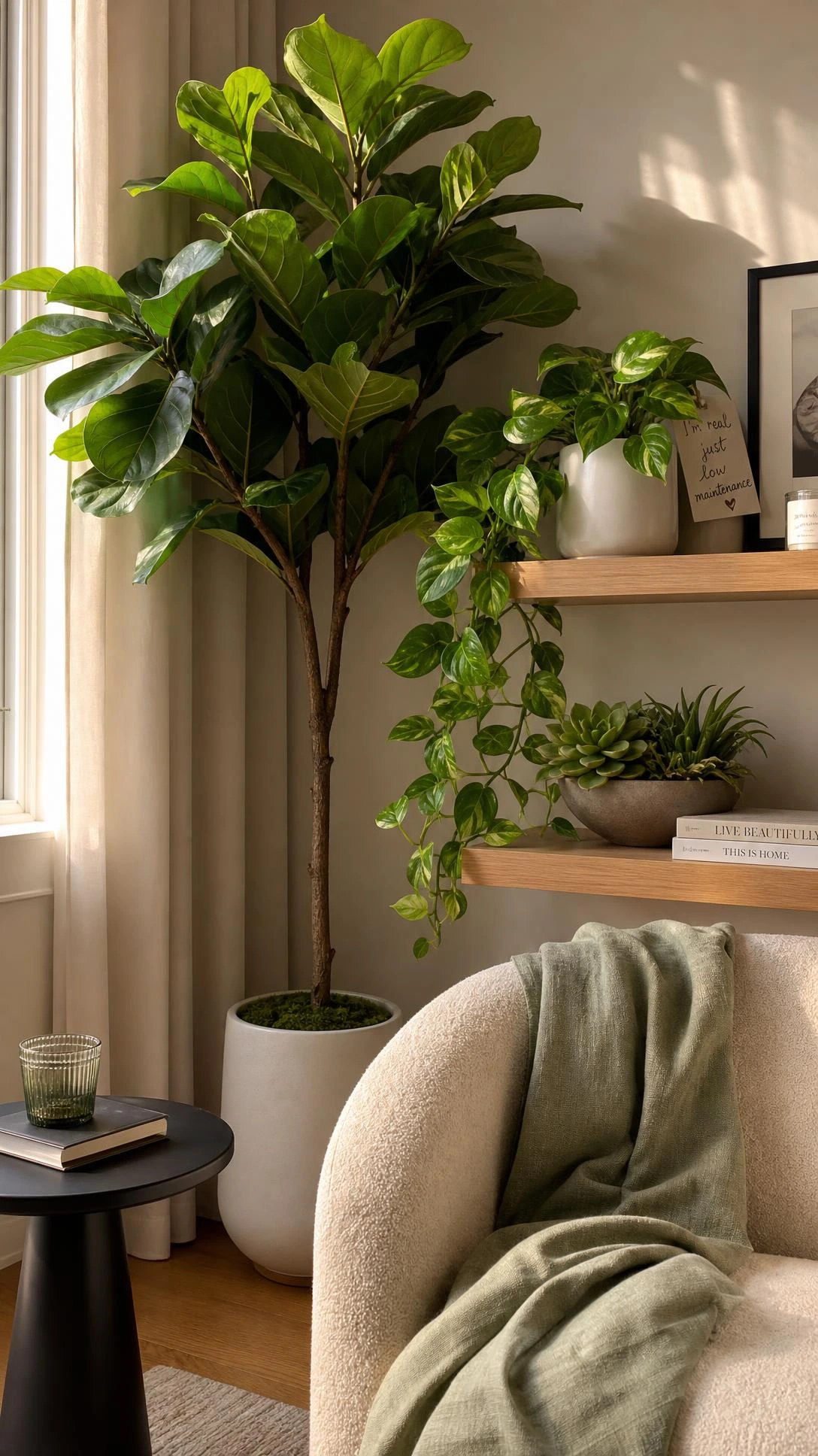
The idea that faux plants are only acceptable indoors, and that outdoor spaces need to be all real or nothing, is one that trips people up constantly when they are trying to style a patio or a balcony.
Mixing real plants with high-quality faux ones in an outdoor space adds fullness and variety without the upkeep of keeping an entire container garden alive through heat, drought, or neglect.
UV-resistant faux greenery has gotten genuinely good in the last few years and options like trailing ivy, boxwood topiaries, and faux agave hold up outdoors without fading for a full season.
The key is using the faux plants for the structural or background pieces, like a tall filler in a large planter, and keeping the real ones where texture and bloom variation matter most.
Nobody can actually tell the difference from the patio furniture, which is always a nice surprise the first time someone tries it.
The Simplest Way to Start Breaking These Rules
None of these changes require a renovation or a budget overhaul, which is the part most people miss when they think about updating a space.
Most of them come down to letting go of the default choice and asking whether the safe option is actually the best one for the specific room.
Starting with just one change, like leaning art instead of hanging it, or swapping a neutral rug for something with real color, tends to make the rest of the room look better almost automatically.
A room that feels right is usually just one or two small decisions away from getting there.
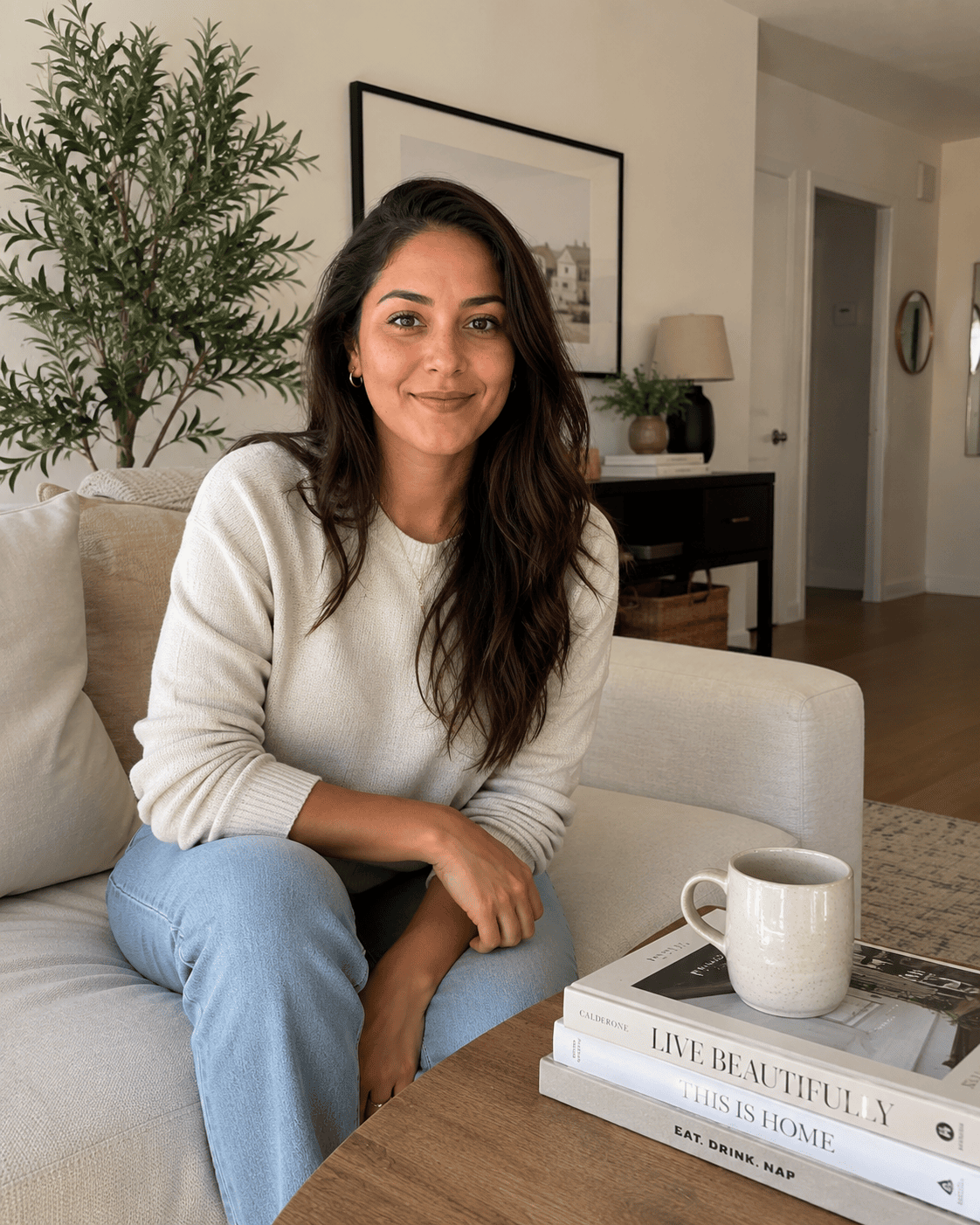
Hi, I’m Alizabeth, the creator of Pretty Home Hacks. I share practical home decor ideas, easy DIY projects, organization tips, and budget-friendly ways to make your home feel more beautiful and functional. From small room updates to everyday home hacks, my goal is to share approachable ideas you can actually use in your own space.