

10 Curtain Color Ideas Most People Get Wrong and How to Finally Get It Right
Curtain color is one of those decisions people assume is simple until the curtains actually go up and something feels completely off but nobody can name why.
The room just looks a little flat, or a little cold, or a little too much like a hotel that tried too hard and missed the mark by about three feet.
Most people pick curtain colors the same way they pick a throw pillow — grab something that looks nice in the store or on the screen and hope for the best once it is hanging.
The problem is curtain color does not just sit there looking pretty; it interacts with the light, the walls, the floor, and the entire mood of the room all day long as the light shifts.
These ten ideas cover the colors and approaches that tend to go sideways most often, and what actually works instead.
1- Bright White Curtains in a North-Facing Room
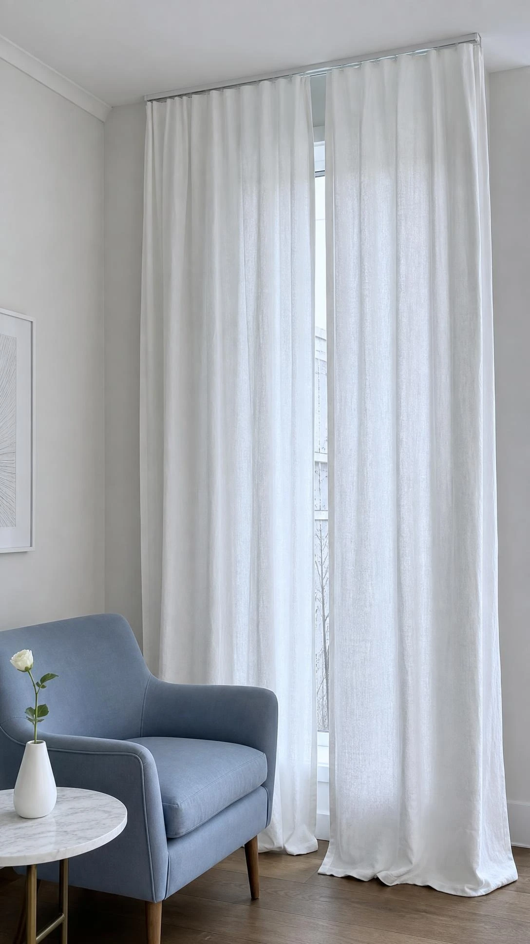
North-facing rooms already run cool and a little dim, and bright white curtains in that light tend to look stark rather than crisp.
The white picks up the blue undertone that north light carries and the whole room ends up feeling colder than it actually is.
A warm white like Sherwin-Williams Alabaster or a soft linen off-white pulls the light in a warmer direction without darkening the room.
The difference is subtle in the store but obvious once the curtains are hanging and the afternoon light hits them.
Most people do not realize white has undertones until they hang the wrong one and suddenly the room feels like a dentist’s waiting area.
2- Matching Curtains Exactly to the Wall Color
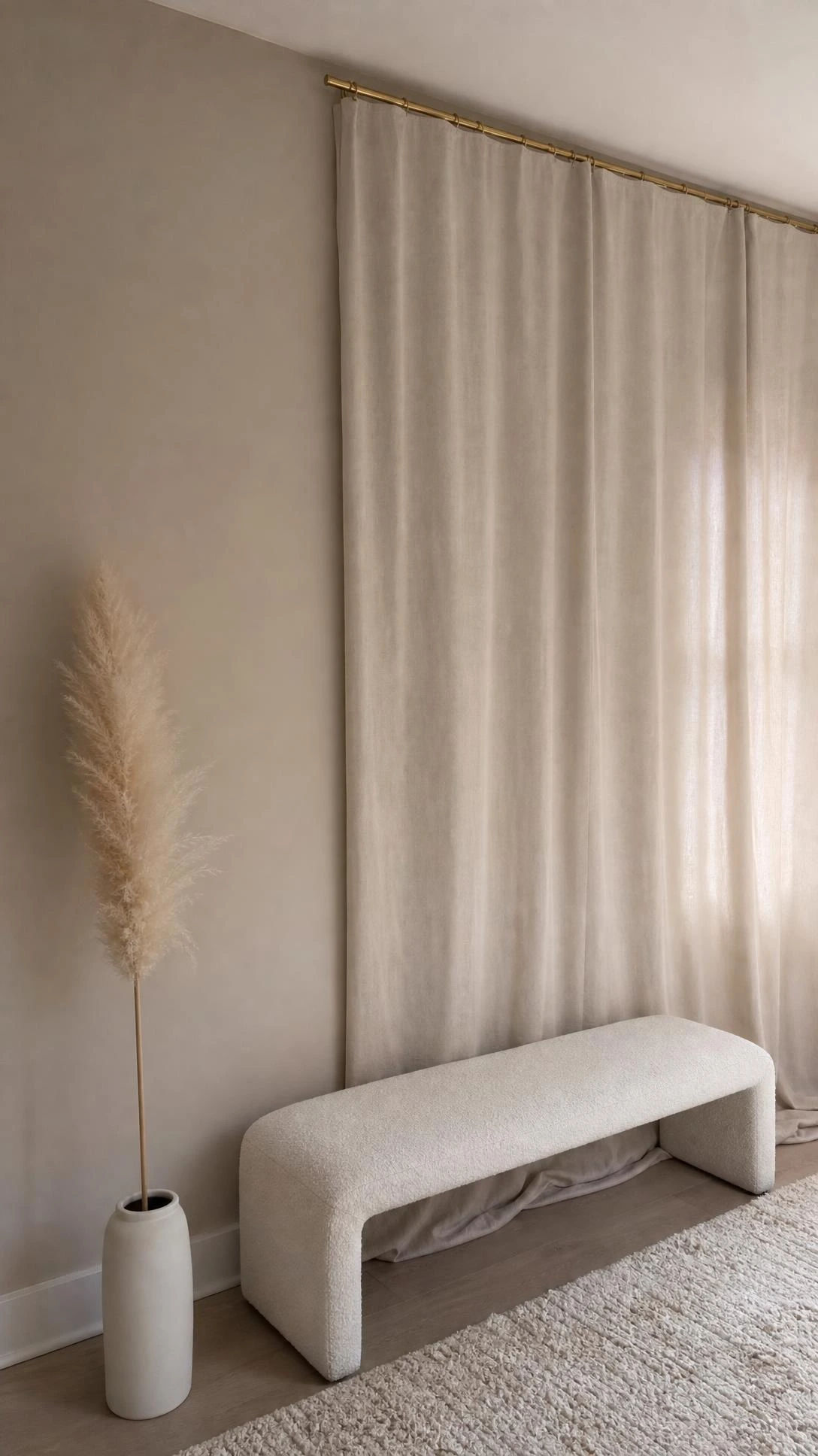
The idea of matching curtains to walls sounds cohesive in theory and usually ends up looking like the windows disappeared into the room.
When curtain and wall are the exact same shade, there is no separation, no depth, and the windows lose the visual weight they are supposed to carry.
Going one or two shades deeper than the wall color in the same family is what actually creates that pulled-together look people are going for.
For a sage green wall around Benjamin Moore’s Saybrook Sage, a curtain in a deeper eucalyptus or hunter reads as intentional rather than accidental.
The goal is contrast within the same color story, not a perfect match.
3- Beige Curtains When the Room Already Has Warm Neutrals
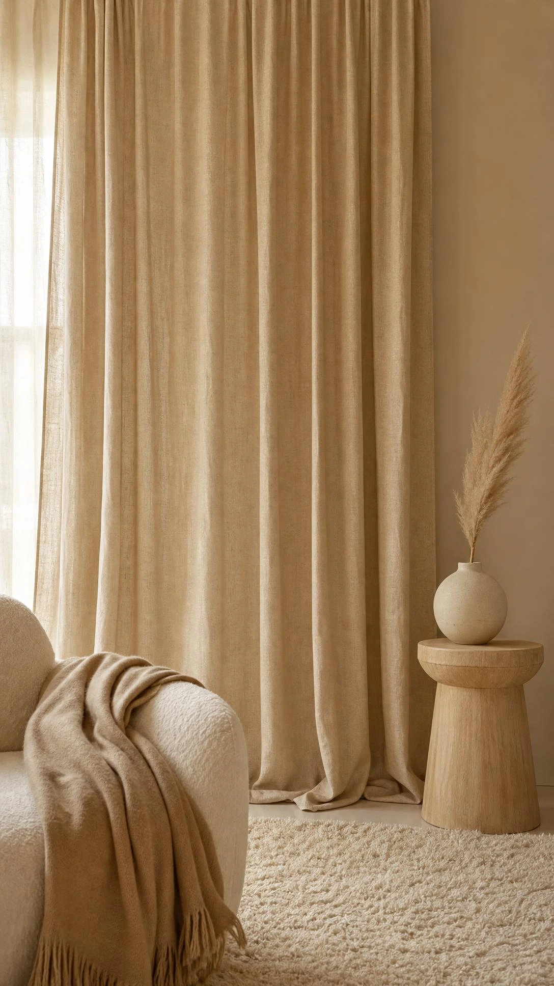
Beige on beige on beige is one of those combinations that feels safe and ends up feeling a little lifeless by the time everything is in the room.
When the sofa, the rug, and the walls are all pulling from the warm neutral family, adding beige curtains just adds more of the same with no anchor point.
A warm charcoal, a deep taupe, or even a soft terracotta curtain gives the room something to land on visually.
IKEA’s MAJGULL blackout curtains in beige-gray are a good example of a shade that reads neutral but carries just enough cool contrast to break up an all-warm room.
I think this is one of the most common curtain color mistakes because beige feels like the safe non-choice, when really it is still a choice with real consequences.
4- Dark Curtains in a Small Room Assumed to Be Wrong
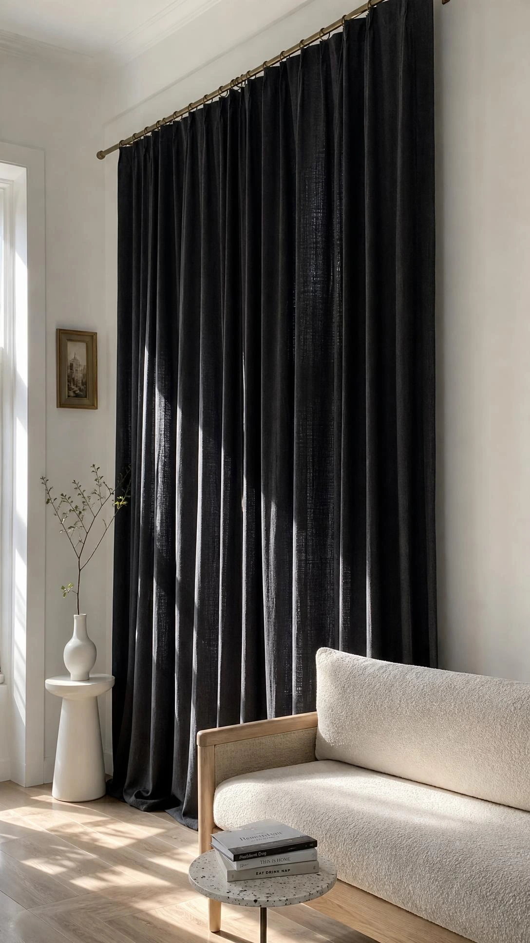
People avoid dark curtains in small rooms almost automatically, assuming they will shrink the space even further, and most of the time that assumption is backwards.
Dark curtains hung high and wide, close to the ceiling and extending past the window frame on both sides, make the window look larger and the ceiling feel taller.
A deep navy or forest green floor-to-ceiling panel in a small living room tends to read as dramatic in a good way rather than heavy or oppressive.
The key is that the curtains have to go all the way to the floor and hang at least four to six inches above the actual window frame.
When dark curtains are hung low and tight to the window, that is when they shrink a room, not when they are given space to breathe.
5- Gray Curtains That Fight the Undertones in the Room
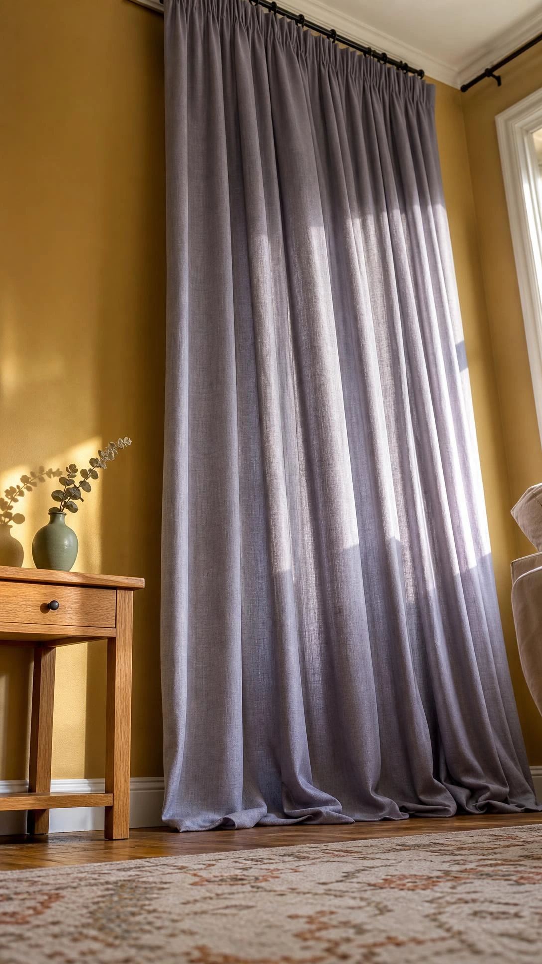
Gray curtains became incredibly popular and now they are also incredibly commonly wrong because gray has about fifteen different personality types depending on its undertone.
A gray with a purple undertone hanging in a room with warm wood floors and caramel leather is going to look like it wandered in from a different house entirely.
Warm grays with a brown or greige base, like a curtain in Restoration Hardware’s Fog colorway, work in warm rooms, and cool blue-grays work in rooms with cooler tones.
Pulling a paint chip of the room’s wall color and looking at it next to the curtain swatch in natural light catches this problem before the panels are hanging.
Most people skip that step and then spend weeks wondering why the room feels slightly wrong without being able to figure out what to fix.
6- Curtain Color Chosen Without Thinking About the Floor
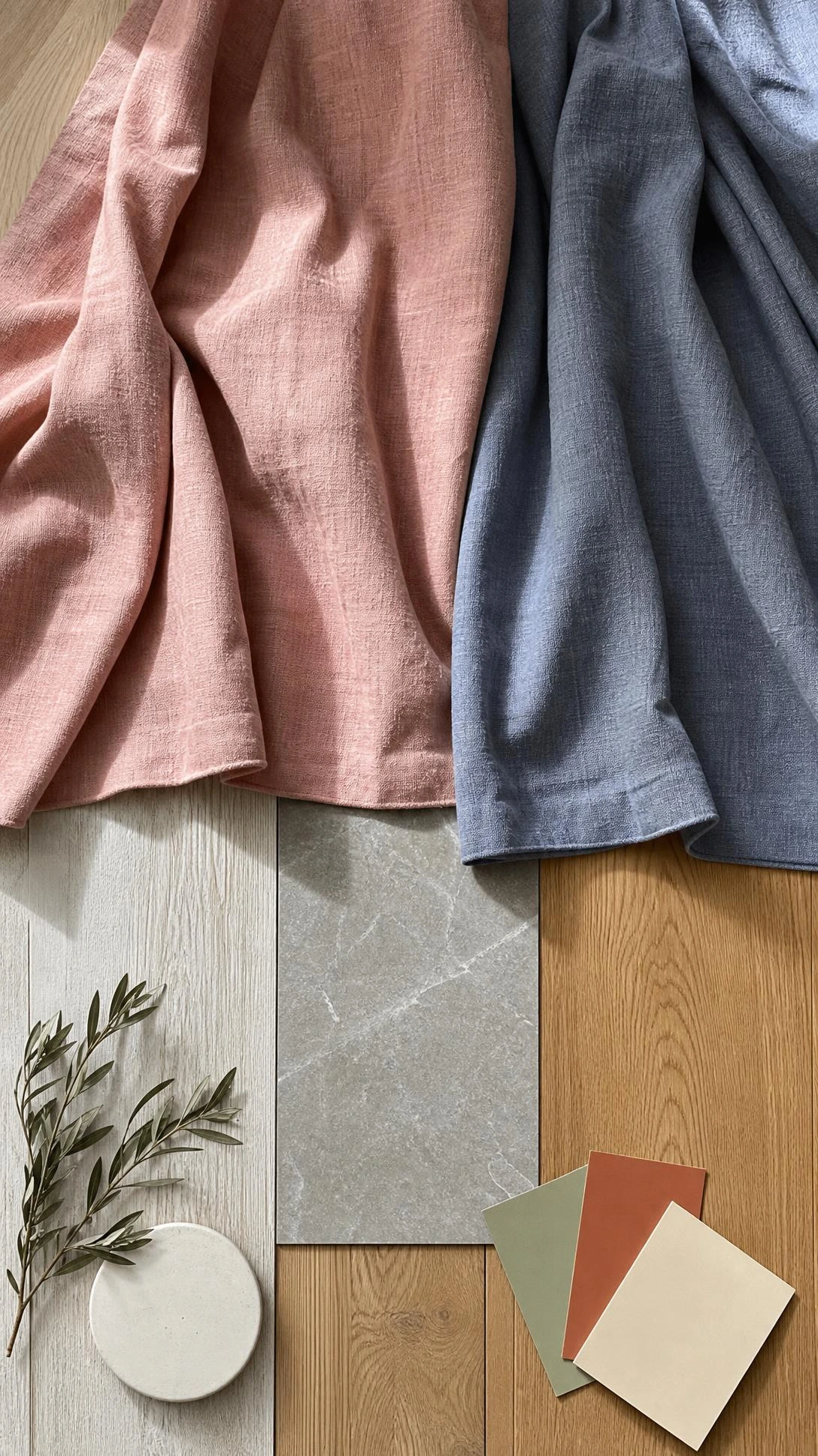
Walls get all the attention when people are picking curtain colors and the floor is almost always forgotten, which is a problem because curtains touch the floor and the eye connects them.
A curtain color that fights the flooring creates a visual stop at the bottom of the panel where the whole look should be flowing and grounded.
With warm honey oak floors, curtains in terracotta, warm cream, or soft rust carry the warmth through the room naturally.
With cool gray tile or whitewashed wood, dusty blue, soft sage, or a cool linen work the same way without clashing at the hem.
The floor is the foundation and curtains are part of the vertical story that connects the floor to the ceiling, so they need to be considered together.
7- Bold Pattern Curtains in a Room That Already Has Pattern
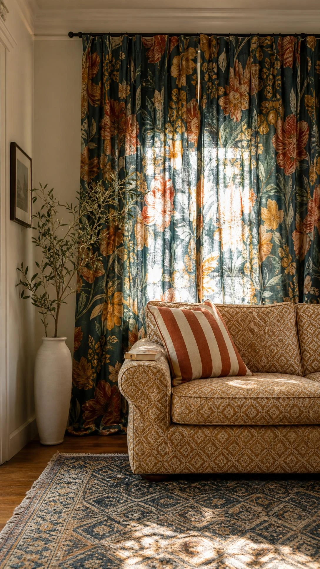
The instinct to add a printed or patterned curtain to a room that feels plain makes complete sense and the execution goes sideways more often than it goes right.
When there is already a patterned rug or patterned throw pillows in the room, a bold curtain print competes rather than contributes and the room ends up feeling restless.
The version that works is a textured solid curtain, something in a linen weave, a subtle slubbed fabric, or a tone-on-tone stripe, which adds visual interest without adding another print.
Target’s threshold linen-look curtains in natural or oatmeal land around twenty dollars per panel and give exactly that kind of texture without competing with anything else in the room.
When the room needs personality and there is already pattern happening, texture in a curtain is almost always the smarter call than another print.
8- Curtain Color Picked to Match the Sofa Perfectly
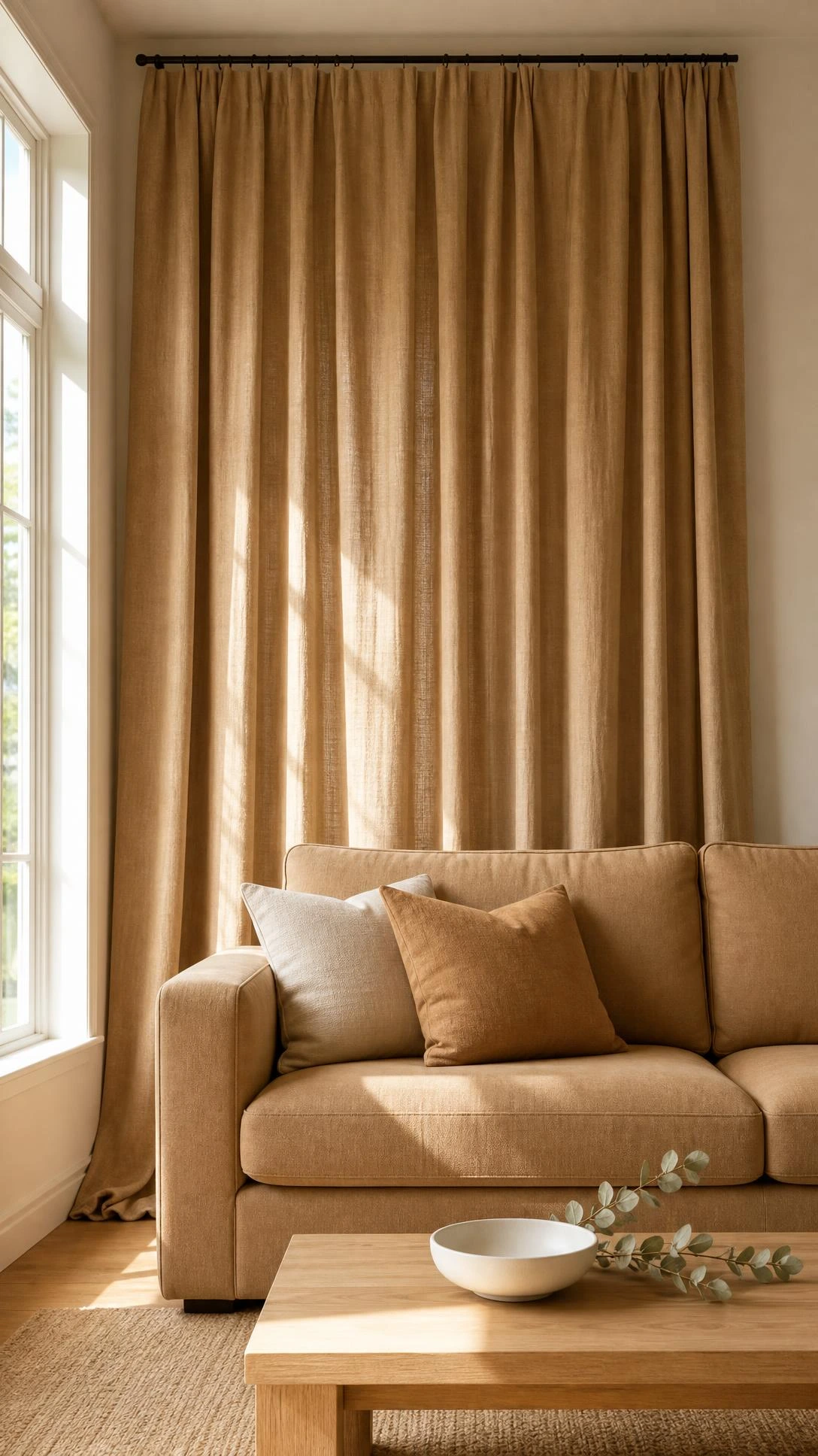
Matching the curtain to the sofa feels like a design move that will pull the room together and what it usually does is make the sofa look like it is wearing a costume.
Exact matches between upholstery and curtain color tend to look intentional in a forced way rather than in a considered way.
The approach that works is pulling a secondary or accent color from the sofa’s fabric, a tonal stripe, a pillow color, or even the piping on the cushions, and using that for the curtain.
A navy sofa with white piping becomes a much more interesting room with soft white or warm cream curtains than it does with navy curtains trying to mirror it exactly.
I think this matching instinct comes from a good place but the goal in a room is harmony, not uniformity, and there is a real difference between the two.
9- Sheer White Curtains in a High-Traffic Area
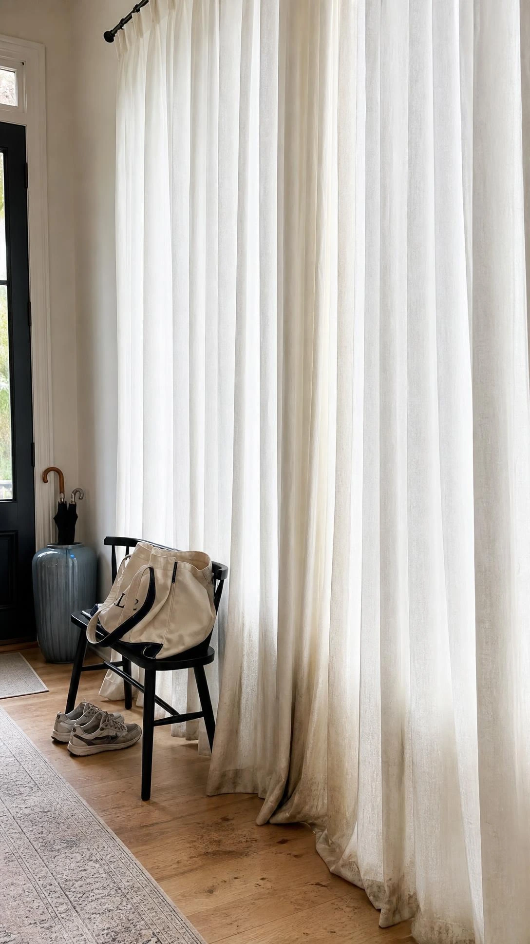
Sheer white curtains look genuinely lovely in a bedroom or a sitting room that does not see a lot of daily chaos.
In a family room, a dining room near a kitchen, or anywhere close to kids or pets, white sheers are going to look dingy within a few months and nobody wants to wash curtains every other week.
A natural linen sheer in a warm oatmeal or pale sand tone hides everyday dust and ambient grime much better than bright white while still letting light filter through softly.
West Elm’s sheer linen curtains in sand or wheat are a good example of that kind of practical-but-still-pretty middle ground that actually survives daily life.
The light effect is nearly identical to white and the tolerance for real life use is considerably higher, which is always a nice surprise for people who make the switch.
10- Playing It Too Safe With Curtain Color the Whole Way Through
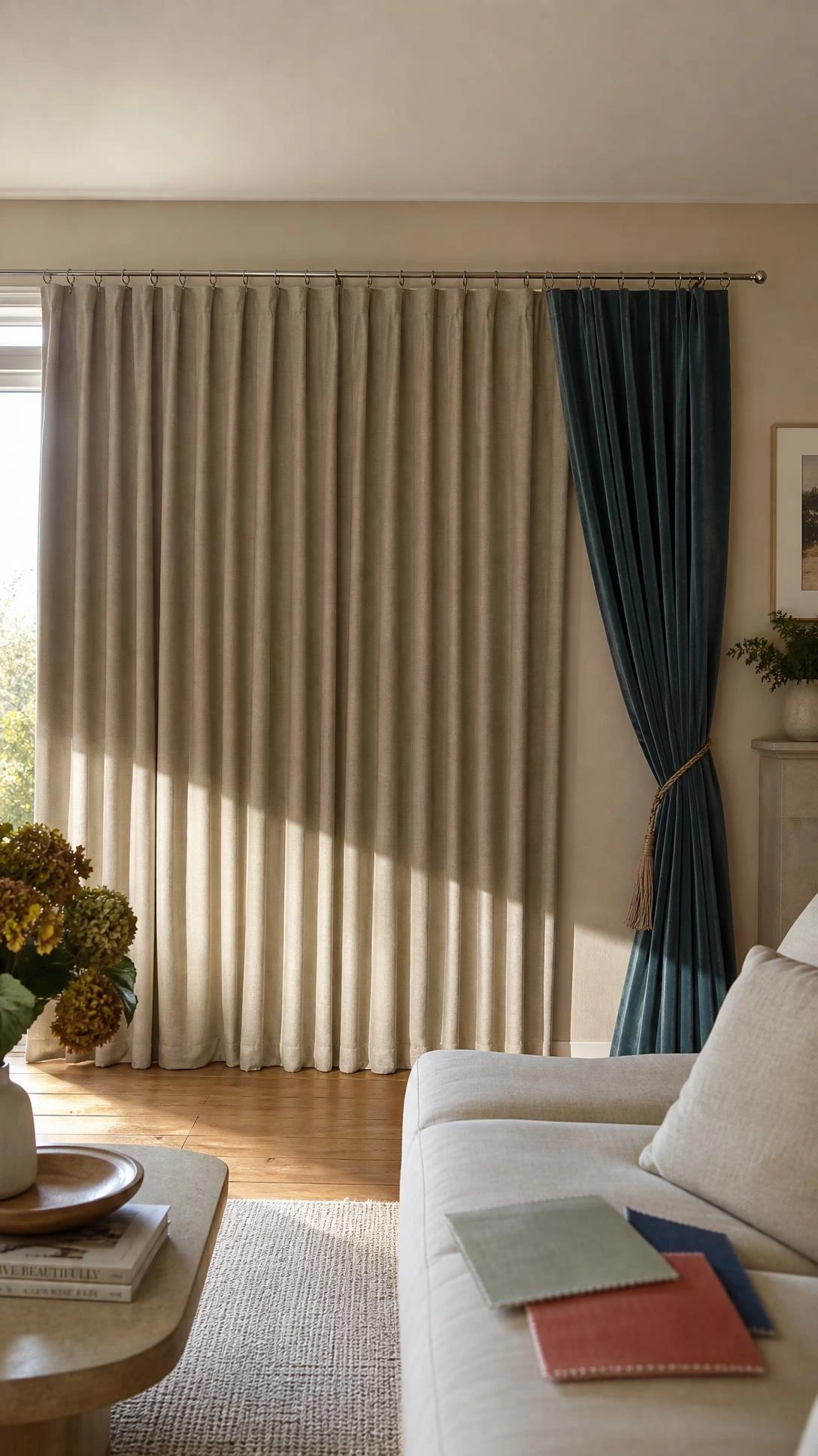
A lot of rooms end up with curtains that are technically fine and completely forgettable because the color decision was driven entirely by the fear of getting it wrong.
Greige, pale gray, or basic ivory in every room is not a design strategy, it is just playing defense, and rooms that only play defense tend to feel like nobody really lives in them.
One room in the house with a bolder curtain color, a rust, a deep teal, a terracotta, a soft burgundy, is usually the room people walk into and immediately want to sit down in.
Bolder curtain colors work best in rooms where the walls are a calm neutral, because the curtain becomes the color moment rather than competing with one.
Starting with one room and one honest color choice is enough to figure out whether going a little further with curtain color is actually something the whole house has been missing.
Curtain Colors Are Worth Getting Right the First Time
Curtains cover a lot of visual real estate in a room and the color carries more weight than most people expect when they are standing in the store holding a swatch.
Most of these mistakes are not about choosing an ugly color but about choosing without thinking through the light, the floor, the undertones, and how the curtain relates to everything else already in the room.
Going back and swapping curtains is not the end of the world, but starting with a little more information makes the first choice much more likely to be the right one.
The room that finally feels right is usually the one where the curtains are not the first thing people notice when they walk in.

Hi, I’m Alizabeth, the creator of Pretty Home Hacks. I share practical home decor ideas, easy DIY projects, organization tips, and budget-friendly ways to make your home feel more beautiful and functional. From small room updates to everyday home hacks, my goal is to share approachable ideas you can actually use in your own space.