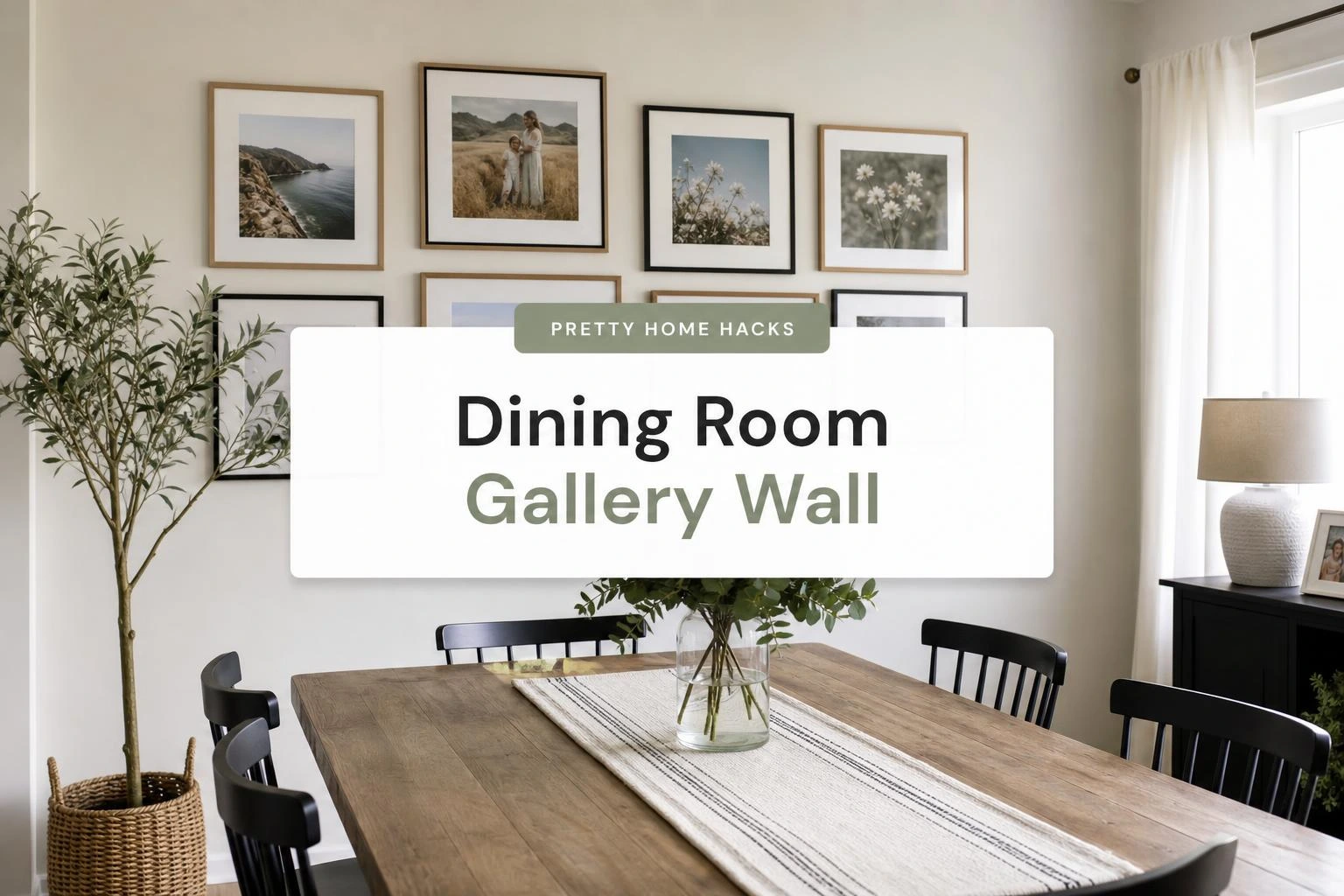
11 Dining Room Gallery Wall Ideas That Actually Look Pulled Together
A dining room wall can sit there being perfectly fine and perfectly forgettable for years before it finally bothers someone enough to do something about it.
It is usually one of those rooms that gets furniture first and then just… waits, like the walls are on a list nobody gets back to.
The tricky part with a dining room gallery wall specifically is that the room already has a big table pulling focus, so whatever goes on the wall has to feel intentional without competing with everything else going on in the space.
Most people assume it means buying a matching set of prints from the same shop and calling it done, which usually ends up looking more like a hotel room than a home.
The ideas here are more specific than that, and a lot of them use things people already have or can find without a huge budget or a full weekend cleared out.
1- Black Frame Grid Above a Sideboard
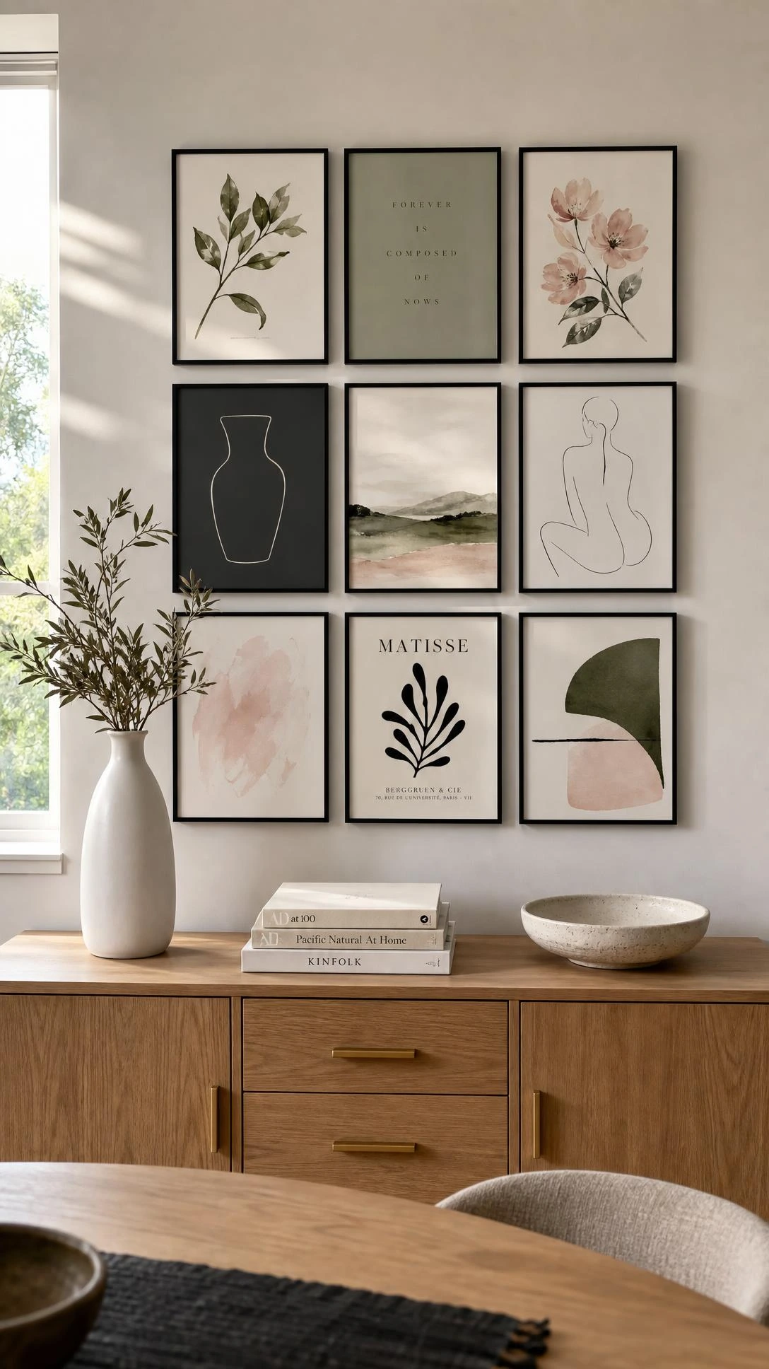
A clean grid of black frames is one of those looks that works in almost any dining room and somehow never gets old.
The key is committing to one frame style and keeping the spacing tight, around two to three inches between each frame, so it reads as one intentional unit instead of a scattered collection.
A three by three grid of five by seven prints hung above a sideboard or buffet table is probably the most satisfying version of this, because the furniture grounds the whole arrangement.
Black frames from IKEA’s Ribba line run under two dollars each and hold up well, which is always a nice surprise when the finished wall looks like it cost significantly more.
This works best when the prints share at least one thing in common, whether that is a color palette, a subject matter, or even just a similar level of contrast.
2- Mixed Size Frames With a White Mat Border
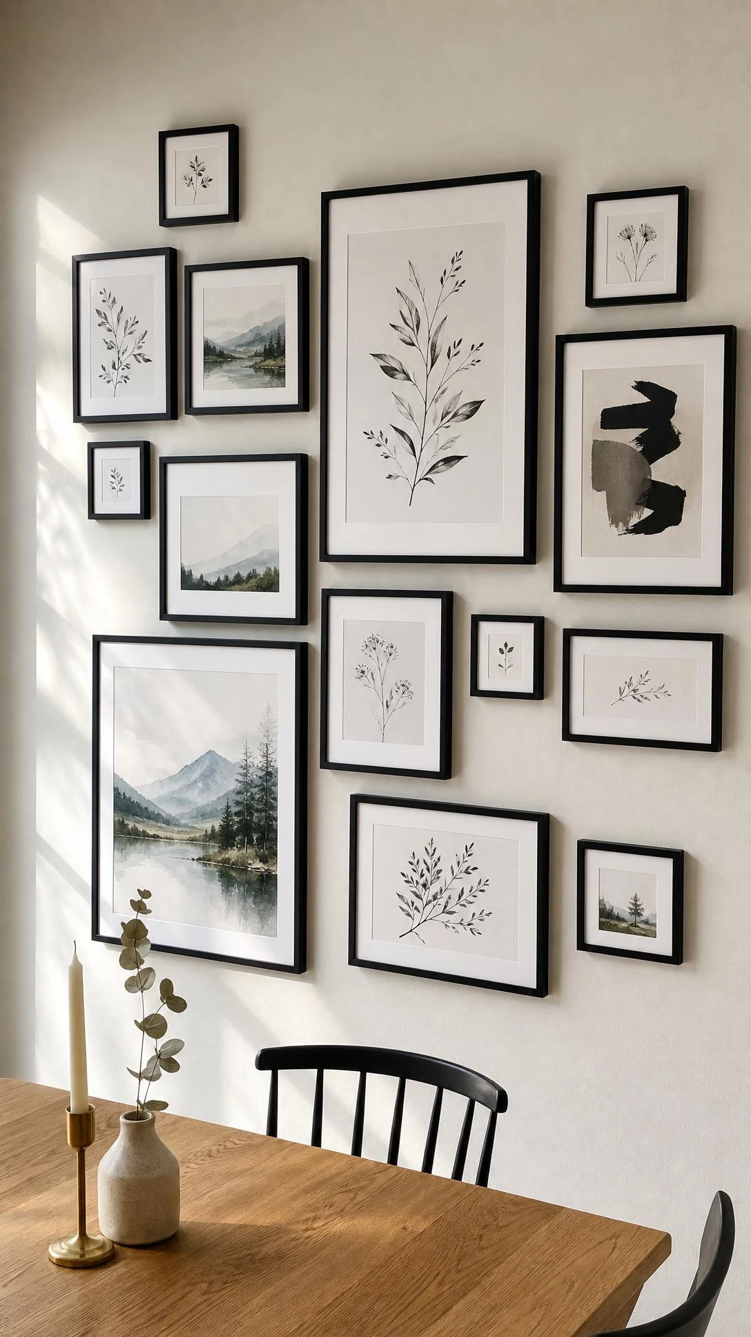
One of the things that makes a dining room gallery wall look messy instead of curated is frames of different sizes with no visual connector between them.
White mat borders solve that problem without requiring matching frames, because the white space around each piece acts as a reset between different sizes and styles.
A five by seven photo matted inside an eleven by fourteen frame instantly looks like it belongs next to a larger piece, which sounds like a small detail but makes a big difference on the wall.
This approach also lets people use sentimental photos alongside art prints without the whole thing feeling like a random mix, because the mats bring a quiet consistency across everything.
It is also one of the more forgiving layouts because adding one more frame to the edge later does not throw off the whole arrangement the way a rigid grid would.
3- Vintage Mirror Collection as the Focal Point
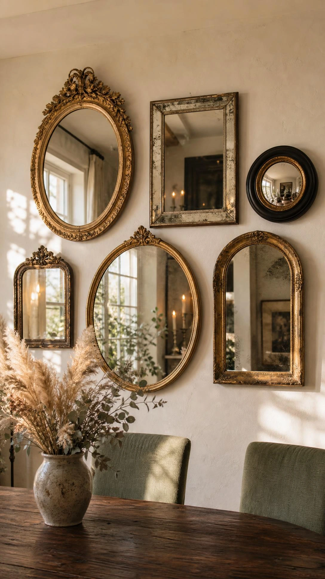
Nobody really talks about mirrors as gallery wall material but they are one of the best things to use in a dining room specifically because of how they interact with candlelight or overhead lighting at night.
A grouping of three to five vintage mirrors in different shapes, round, arched, rectangular, creates depth that flat art prints simply cannot replicate.
Thrift stores and Facebook Marketplace are genuinely the best sources for this, and most ornate vintage mirrors sell in the fifteen to forty dollar range depending on size and condition.
The arrangement does not need to be symmetrical, which is actually what makes it feel more interesting than a standard gallery wall setup.
I think the sweet spot is mixing one larger mirror as the anchor and then grouping two or three smaller ones around it at varying heights so the whole thing feels collected over time rather than purchased as a set.
4- Botanical Print Gallery in Warm Wood Frames
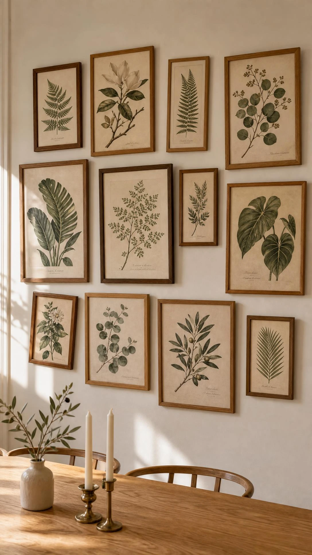
Botanical prints and dining rooms have been a natural pairing for a long time, probably because there is something about plants and food that just belongs in the same space.
Warm wood frames, specifically lighter tones like natural oak or honey-colored beech, make botanical prints feel relaxed and lived-in rather than formal.
Free botanical illustrations from sites like Biodiversity Heritage Library print beautifully at eight by ten or eleven by fourteen, which means the whole wall can come together for the cost of frames alone.
A loose asymmetric arrangement works better here than a strict grid because the organic shapes in botanical art already carry enough visual structure on their own.
This look tends to feel especially good in dining rooms with natural wood furniture or warm-toned walls, somewhere in the terracotta, warm white, or sage green range.
5- Family Photo Wall With One Bold Art Print
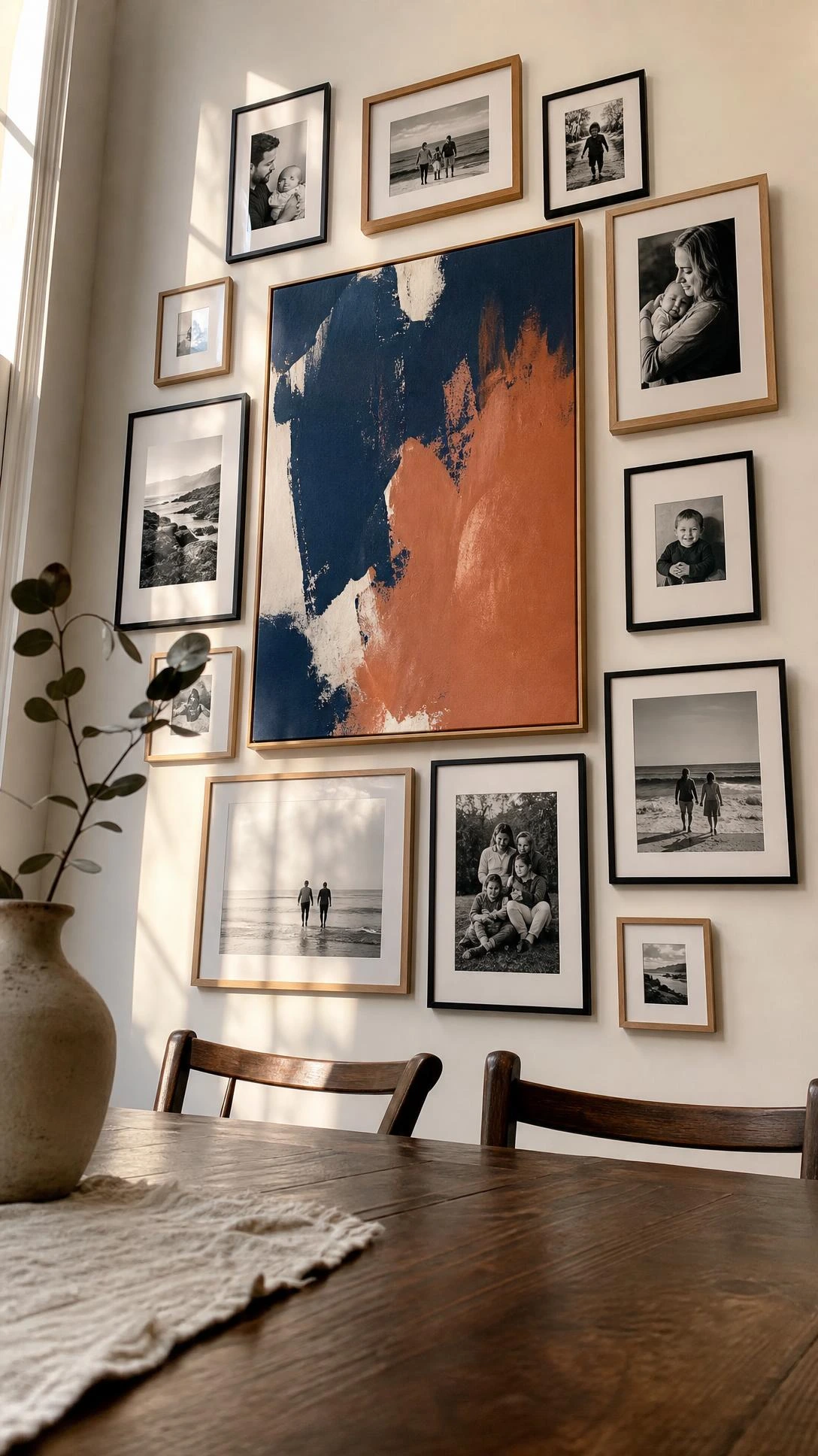
A dining room is one of the few places in a home where a family photo wall does not feel out of place, because it is already a room built around gathering together.
The version that avoids looking like a school hallway display is mixing the family photos with one larger bold art print, something abstract or graphic, that anchors the whole arrangement.
Converting family photos to black and white before printing keeps them from visually clashing with each other and with whatever art piece they are grouped alongside.
The art print does not need to be expensive, a twenty dollar poster print in a larger format, something around sixteen by twenty or eighteen by twenty-four, is enough to anchor a grouping of six to eight smaller photos.
Once people stop trying to make every photo the same size and finish, this kind of wall comes together a lot more naturally than expected.
6- Plate Wall Display Mixed With Framed Art
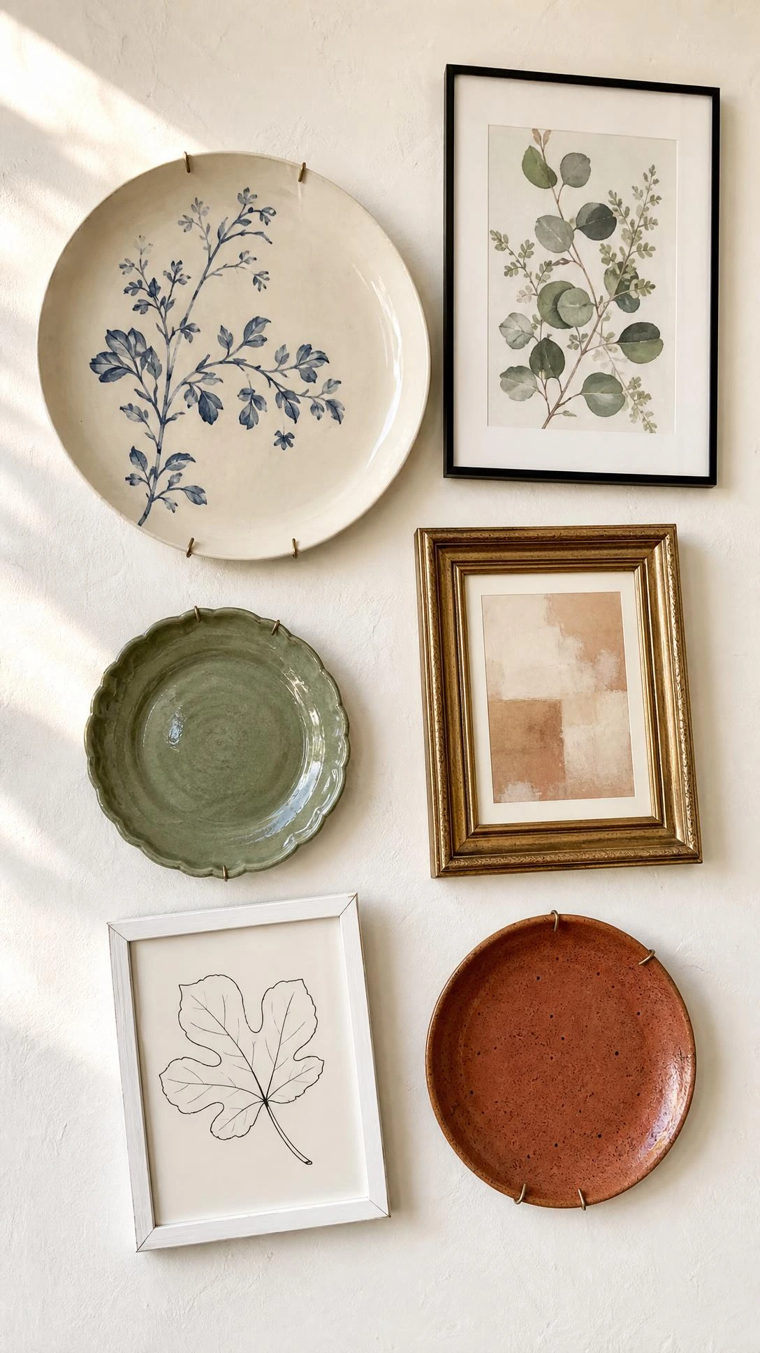
Decorative plate walls look intimidating to put together but are actually one of the most forgiving gallery wall options because the round shapes naturally create rhythm and spacing without much planning.
The mix of plates and framed art is the version that elevates it past the traditional grandma-china look, especially when the frames are modern and the plates lean graphic or sculptural rather than painted floral.
Plate hangers that grip the back of the plate without drilling cost around three to five dollars per plate and hold most standard dinner plate sizes securely.
Keeping the plate colors within a similar palette, all white, all blue and white, or all earthy terracotta tones, pulls the whole mixed display together without needing to overthink the layout.
This works particularly well on plaster walls or in rooms with a slightly older architectural character where a perfectly modern grid would feel out of place.
7- Travel Photo Wall With Souvenirs and Maps
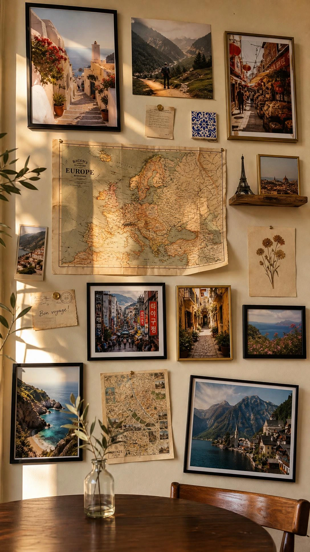
A dining room is a surprising but genuinely good place for a travel-themed gallery wall because dinner conversation and travel memories tend to go together naturally.
The version that reads as intentional rather than cluttered uses framed photos as the base layer and adds one or two dimensional objects, a small folded map, a postcard pinned to cork, a tiny mounted souvenir, to create depth.
Mixing photos printed in a consistent square format, four by four or five by five, gives the travel wall a more modern feel than a scatter of different sizes and orientations.
A thin painted or stained wood ledge shelf across one section of the arrangement lets people prop smaller items without nailing everything individually, which makes rearranging much easier when new travel happens.
The goal is just to make the wall feel like a story, not a scrapbook, so editing out the less interesting pieces and keeping only the ones with a real memory attached makes a noticeable difference in how the whole thing reads.
8- Textile and Woven Art Mixed Into the Gallery
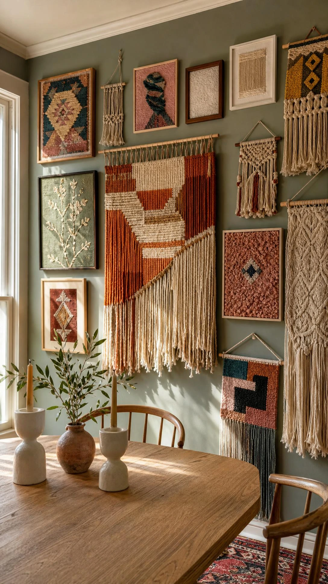
Most dining room gallery walls stay completely flat and two-dimensional, which is exactly why adding one or two woven or textile pieces changes the entire feel of the wall.
A small macrame panel, a woven wall hanging, or even a piece of fabric stretched over a canvas and framed adds texture that catches light differently throughout the day and makes the whole arrangement feel warmer.
Etsy is still the best place to find handmade woven pieces in the thirty to seventy dollar range that look significantly more expensive than they are, especially in natural cotton or jute tones.
The textile piece works best as an off-center anchor rather than the middle of the arrangement, because perfectly centered tends to make it feel forced rather than collected.
Rooms with linen curtains, cane furniture, or natural wood tones respond particularly well to this kind of mixed-material gallery wall approach.
9- Shelf and Frame Combo Along One Wall
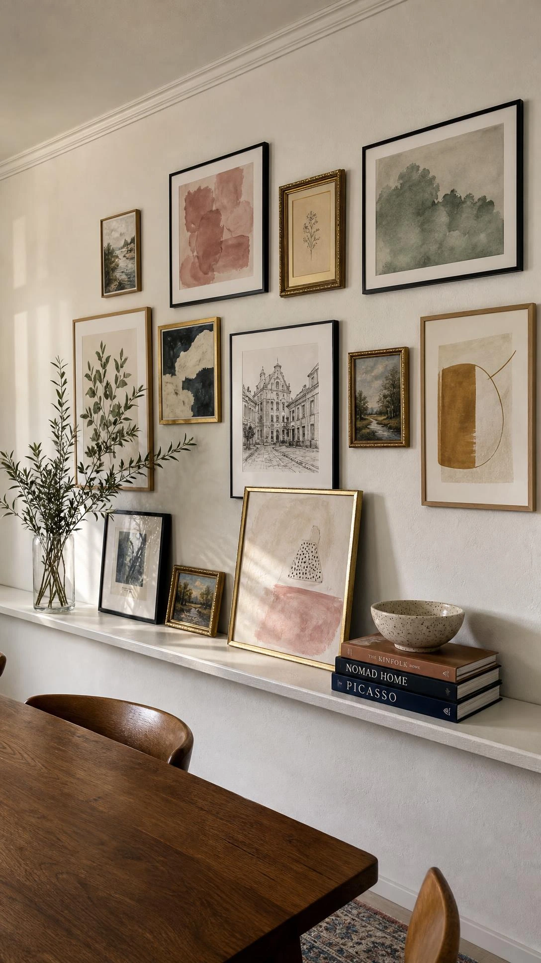
Picture ledge shelves running horizontally across a dining room wall are one of those solutions that look more curated than they have any right to for how easy they are to install and rearrange.
The combination of floating frames leaned against the wall with small objects propped in front, a candle, a small plant, a ceramic piece, creates a layered look that a flat gallery wall cannot replicate.
IKEA’s Mosslanda picture ledge at fifty-five inches wide runs around fifteen dollars and holds most standard frame sizes without leaning forward, which is the detail that makes or breaks this setup practically.
Running two ledges at different heights, one around thirty-six inches from the floor and one at about fifty-four inches, gives the arrangement a more dynamic feel than a single ledge in isolation.
The best part of this format is that swapping out art seasonally takes about thirty seconds, which is not a small thing when the rest of home decorating tends to involve a lot more commitment.
10- Oversized Single Statement Print
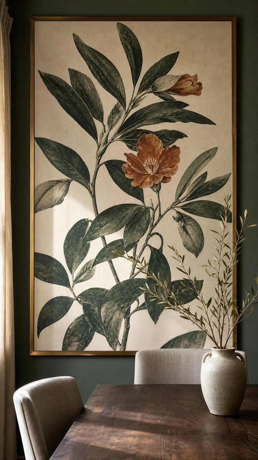
Not every dining room needs a gallery of multiple pieces, and sometimes one large print done well is a stronger choice than a whole collection of smaller ones competing for attention.
A single oversized print, somewhere in the twenty-four by thirty-six to thirty by forty range, hung centered above a sideboard or on the main wall of the dining room reads as confident and intentional in a way that smaller groupings can sometimes miss.
Abstract art, large-scale botanicals, and black-and-white architectural photography all translate particularly well at this scale without becoming overwhelming in a smaller dining room.
Printing through a service like Mpix or Artifact Uprising at a larger size and framing it in a simple wide-profile frame keeps the overall cost under a hundred dollars for something that looks genuinely gallery-quality.
This approach works best in dining rooms that already have a lot of texture or pattern happening elsewhere, where adding more frames would tip the room into busy territory.
11- Rotating Seasonal Art Swap on Picture Ledges
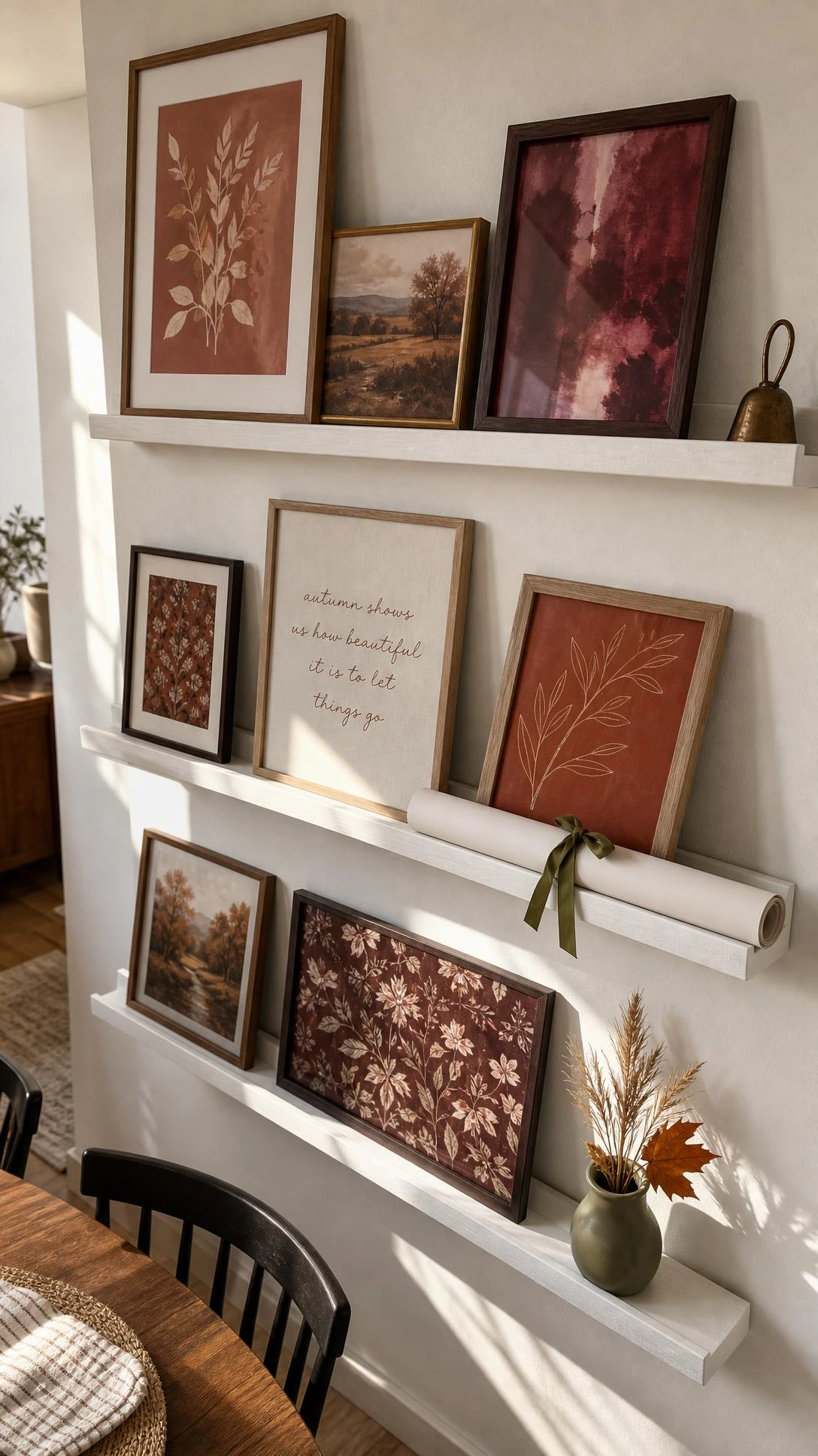
One thing people do not think about when planning a dining room gallery wall is what happens six months later when the initial excitement wears off and the same prints feel stale.
Building the gallery wall around picture ledges from the start means the art can be swapped out seasonally without touching a single nail or leaving new holes in the wall.
A small collection of four to six seasonal art prints per season, stored flat in a shallow box, is all it takes to keep the wall feeling fresh through the year without buying new frames or rehooking anything.
Deep green and warm amber prints for fall, loose floral and soft blue for spring, something graphic and high-contrast for winter make the rotation feel intentional rather than random.
I think this is genuinely the smartest long-term setup for a dining room gallery wall because it keeps the room feeling like it is actually being lived in rather than styled once and frozen in place.
The Dining Room Wall That Finally Feels Finished
A dining room gallery wall does not need to be planned perfectly from the start to look good.
Most of the best versions come together gradually, one good frame at a time, which is actually more satisfying than buying everything at once and hanging it in a single afternoon.
The room already does a lot of work as a gathering space, and the wall just needs to feel like it belongs to the same people who sit around the table.
Start with one section, get that right, and the rest of the wall tends to follow on its own timeline.
Hi, I’m Alizabeth, the creator of Pretty Home Hacks. I share practical home decor ideas, easy DIY projects, organization tips, and budget-friendly ways to make your home feel more beautiful and functional. From small room updates to everyday home hacks, my goal is to share approachable ideas you can actually use in your own space.