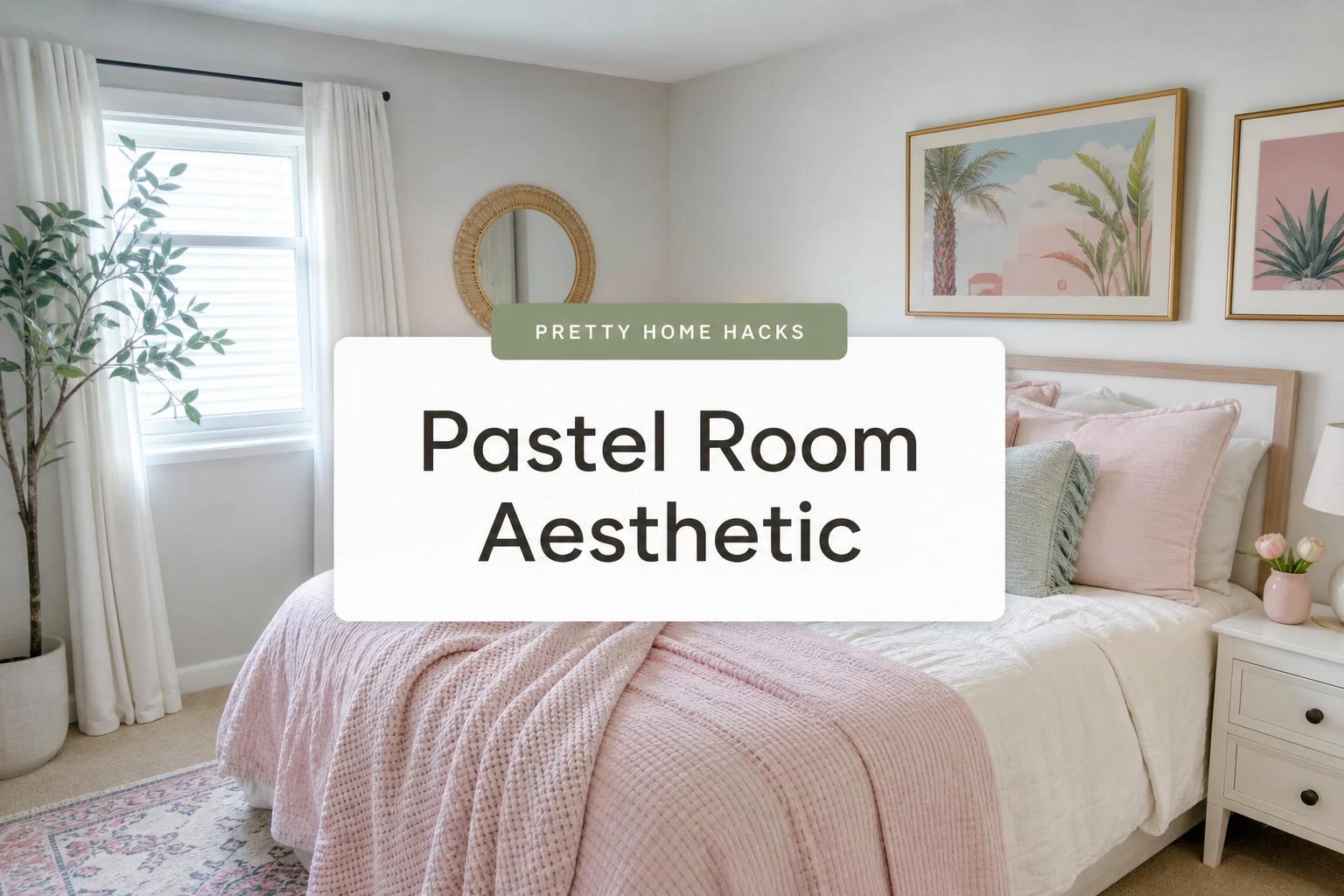
How to Pull Off a Pastel Room Aesthetic Without It Looking Like a Nursery
Pastel rooms have this reputation for going one of two ways: soft and dreamy in the best possible sense, or somehow ending up looking like a baby shower happened and never fully recovered.
The difference is almost always in the details, specifically which pastels get chosen, what they get paired with, and how much of the room they actually take over.
Most people assume you have to go all-in for pastels to read as intentional, like painting every wall and swapping out every piece of furniture for something blush or lavender.
That is not really how it works, and honestly the rooms that nail the pastel aesthetic decor thing tend to be the ones that show the most restraint.
These ten ideas cover the whole range, from the first small thing to try to the slightly bolder moves worth making once the room starts to feel right.
1- White Walls as the Starting Base
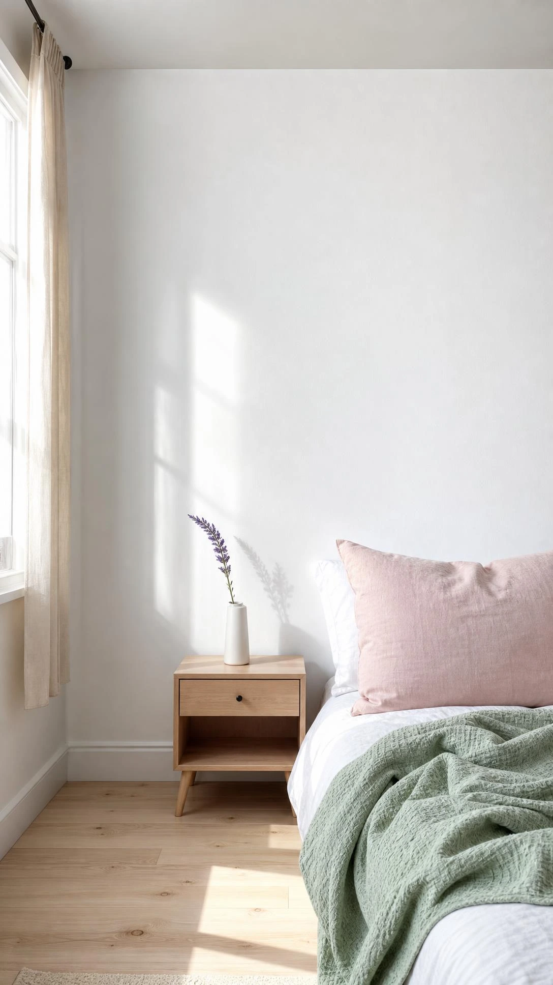
White walls are the reason pastel rooms look light and airy instead of heavy and overwhelming, and it is one of those things that seems obvious until you see the difference in real life.
When pastels sit against white, they pop in a soft way instead of competing with each other for attention.
A warm white like Benjamin Moore’s Chantilly Lace works especially well because it does not pull blue or yellow in the light, so any pastel accessory brought in reads true to color.
This approach also makes the room feel bigger, which is always a nice surprise in smaller spaces.
People who start with white walls find it much easier to shift the color story later by just swapping out textiles, without touching the walls at all.
2- Pastel Throw Pillows for Low Commitment Color
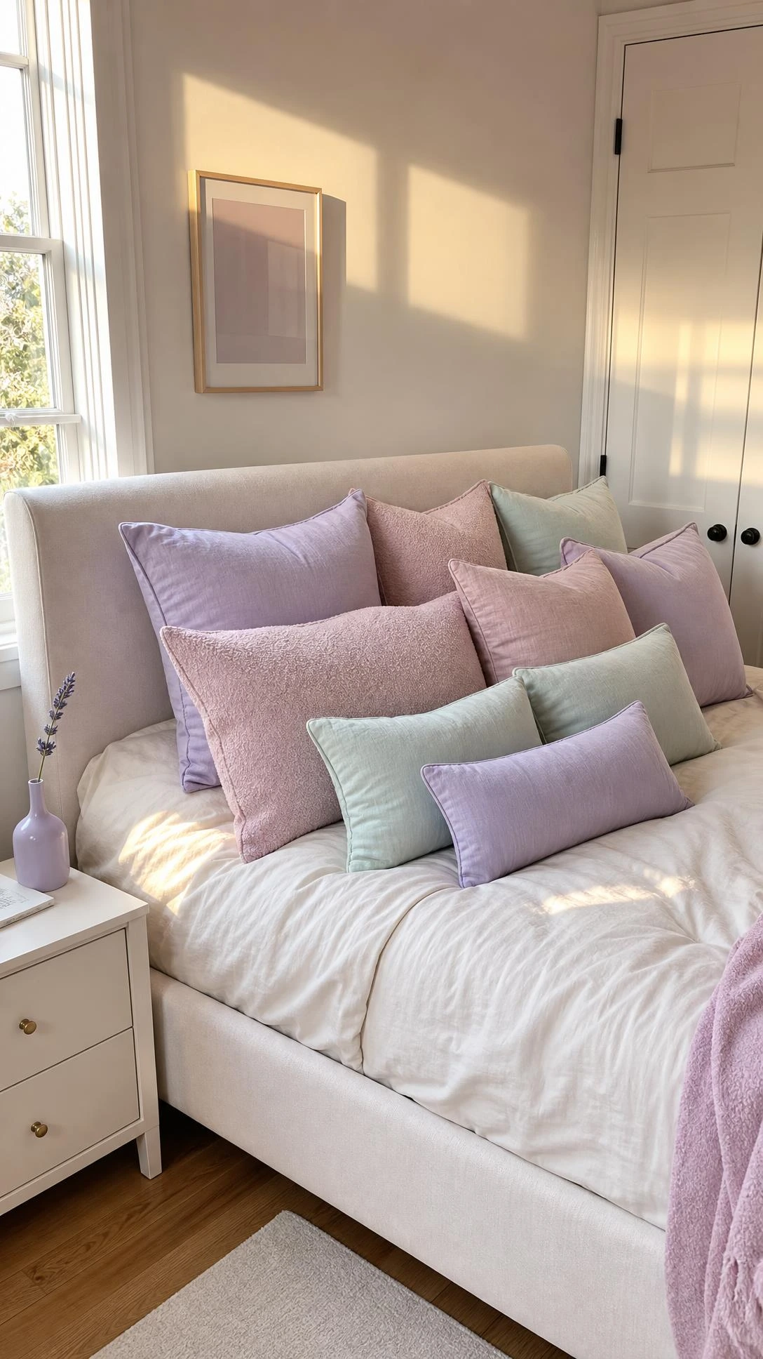
Throw pillows are the most forgiving entry point into a pastel room aesthetic because they cost almost nothing to change if the color ends up feeling wrong.
A mix of powder pink, pale blue, and butter yellow on a white or light linen sofa tends to hit the sweet spot between playful and pulled-together.
The trick is to vary the textures, so a waffle knit pillow next to a smooth cotton one next to something with a subtle pattern keeps the grouping from looking like it was bought as a matching set.
Sets often flatten the look in a way that feels more showroom than lived-in.
Three to five pillows in different pastel tones and sizes is enough to read as intentional without turning the whole sofa into a pastel statement.
3- A Pastel Area Rug to Anchor the Room
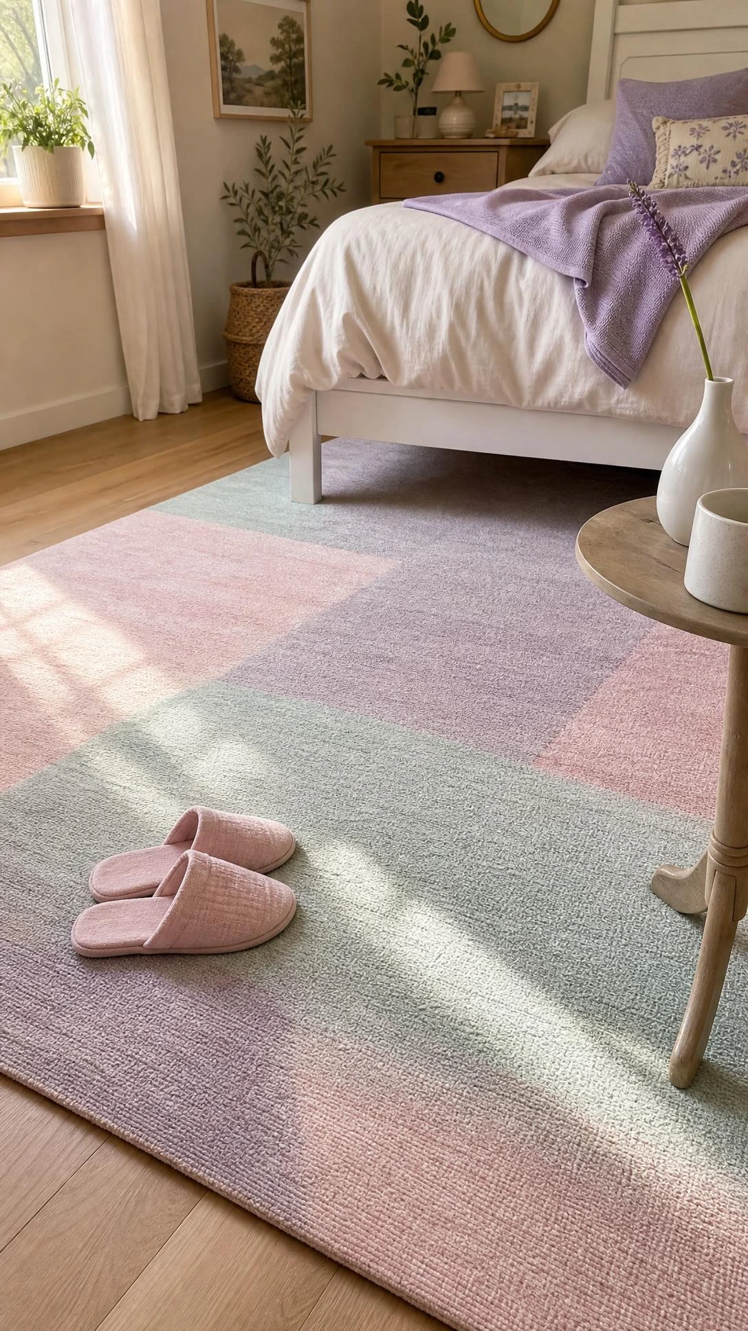
Rugs do more work than most people give them credit for, and in a pastel room they are often the thing that ties the whole color story together.
A soft sage green or dusty lilac rug under a neutral furniture arrangement can bring the pastel palette down to the floor so the room feels cohesive instead of like the color is only floating at eye level.
A flatweave or low-pile style in a faded or vintage-washed finish, something in the range of 8×10 for a living room, tends to look more intentional than a thick plush option in a bright pastel.
Bright tends to read young; faded or muted reads collected and considered.
Rugs in the pastel range are easy to find at places like Ruggable or even Target’s threshold line, usually between $80 and $200 depending on size.
4- Light Wood Furniture for a Scandi-Pastel Mix
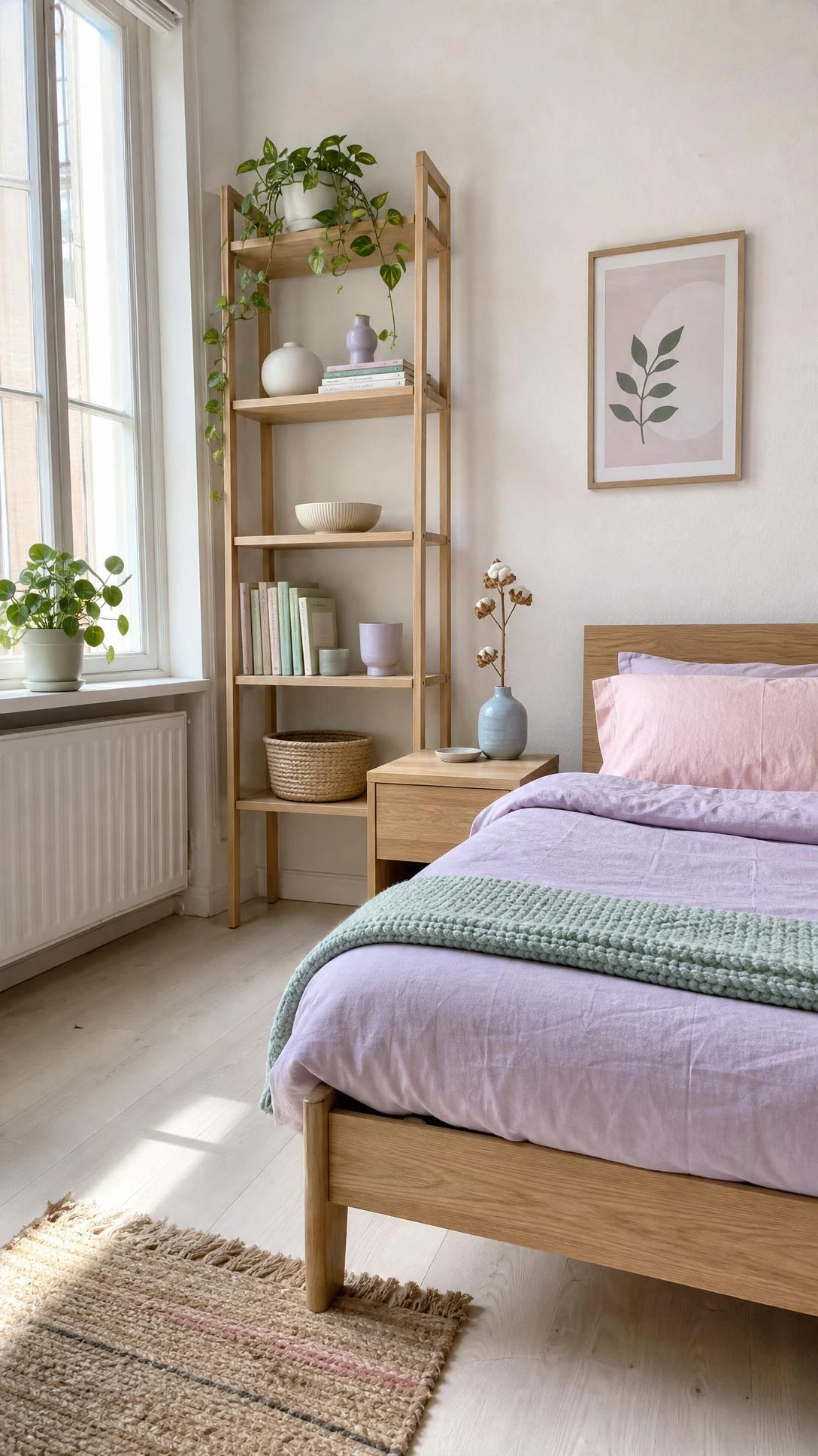
The furniture choice makes or breaks whether a pastel room feels current or dated, and light wood is the thing that keeps it from sliding into either nursery territory or overly sugary.
Scandi-inspired pieces with clean lines and natural birch or oak finishes sit next to pastels in a way that feels grounded and warm rather than precious.
A light oak bed frame or a simple white-washed side table paired with pastel bedding reads as intentional and calm, not like the room is trying too hard.
The wood tone adds just enough organic warmth to balance how soft the colors are.
I think this combination, light wood plus soft pastels, is one of the easiest ways to make a room look put-together without spending a lot of money on it.
5- Pastel Bedding in Gingham or Floral Patterns
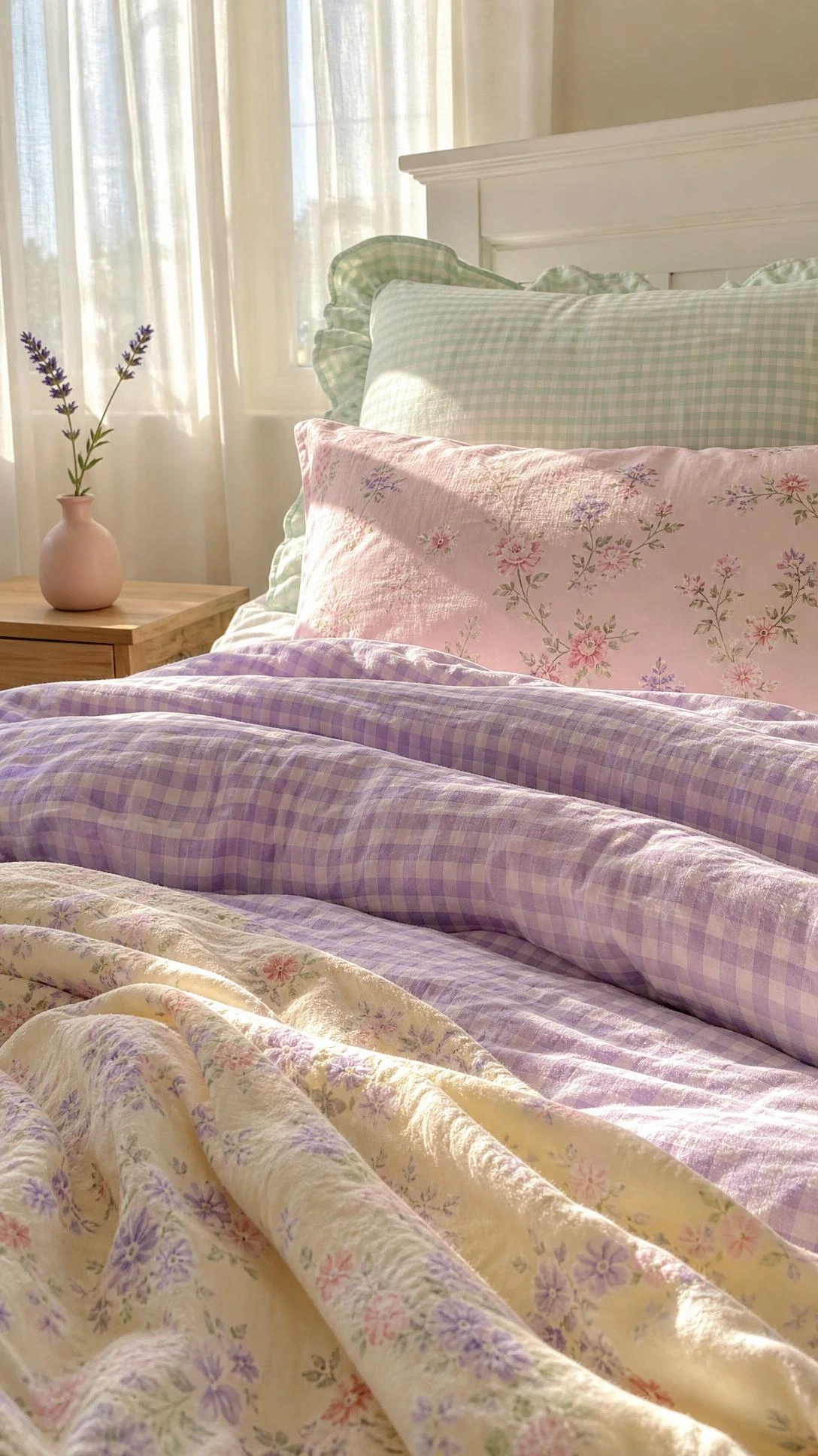
Solid pastel bedding works fine, but patterned versions in gingham or small-scale florals add the kind of visual texture that makes a bed look like it was styled rather than just made.
A pale blue gingham duvet paired with a soft pink euro sham and a white fitted sheet hits the pastel aesthetic without looking matchy or overdone.
The gingham specifically reads very Danish pastel, which is the version of this aesthetic that has felt the most current since around 2020 and still holds up well.
Brands like Piglet in Bed or Society6 carry options in this style, usually in the $60 to $120 range for a duvet cover.
A rumpled, slightly undone bed in soft pastels tends to look more appealing than a perfectly smooth one anyway, which is convenient for everyone who hates making the bed.
6- Pastel Art Prints With Simple Frames
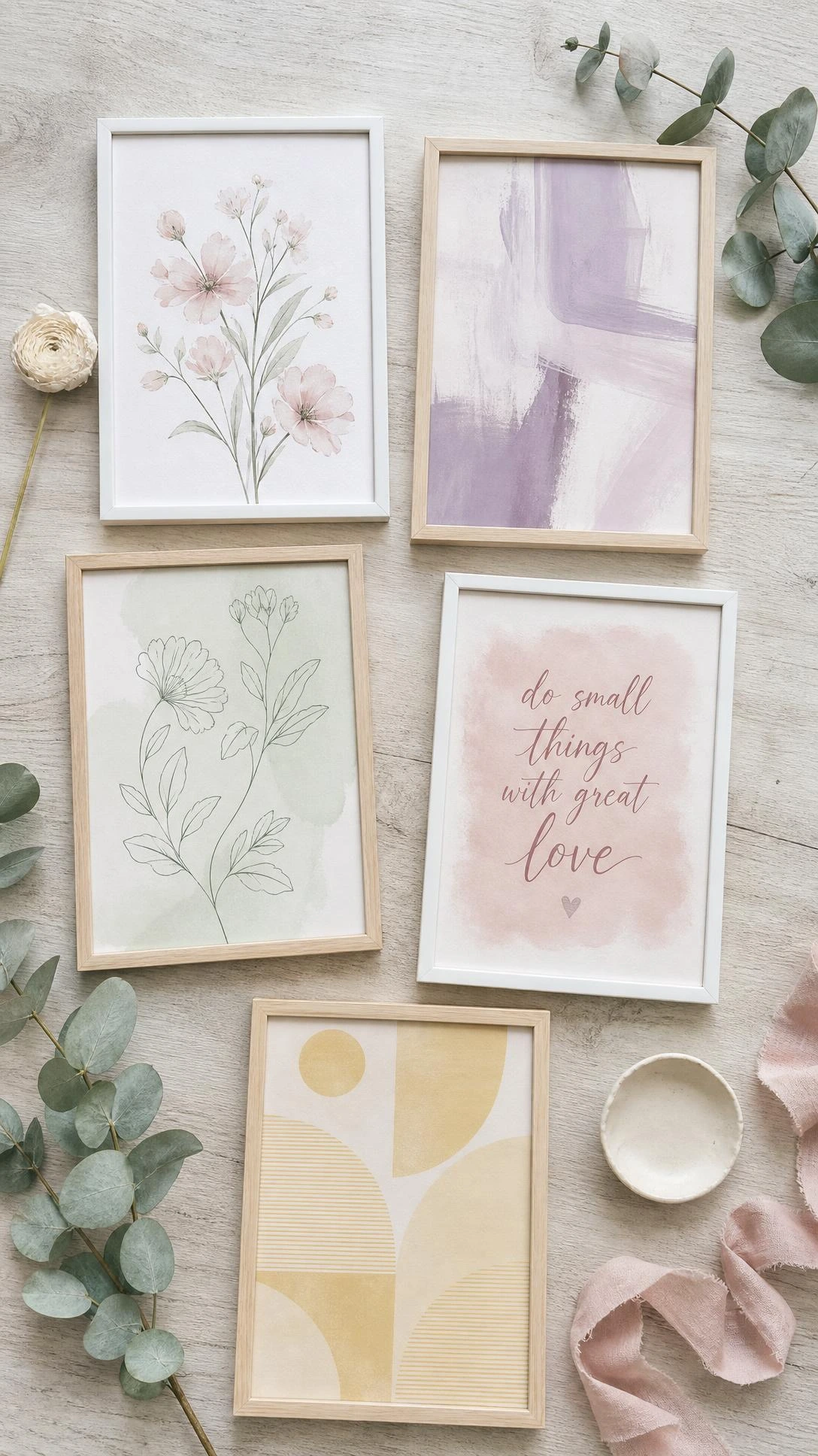
Art is one of the fastest ways to introduce the pastel room aesthetic without changing anything structural about the space.
Prints featuring loose botanicals, abstract shapes, or retro-style typography in pale pink, lilac, or mint green bring in color at eye level where it does the most work visually.
Henri Matisse-inspired prints or mid-century style botanical illustrations work especially well because they carry enough artistic weight to keep the room from feeling like a Pinterest mood board rather than a real space.
Framing them in simple thin white or natural wood frames keeps the focus on the print rather than the hardware.
Etsy shops and Society6 both have a huge range in this style, and most downloadable prints run between $5 and $20 before printing costs.
7- A Wavy Mirror for Softness and Shape
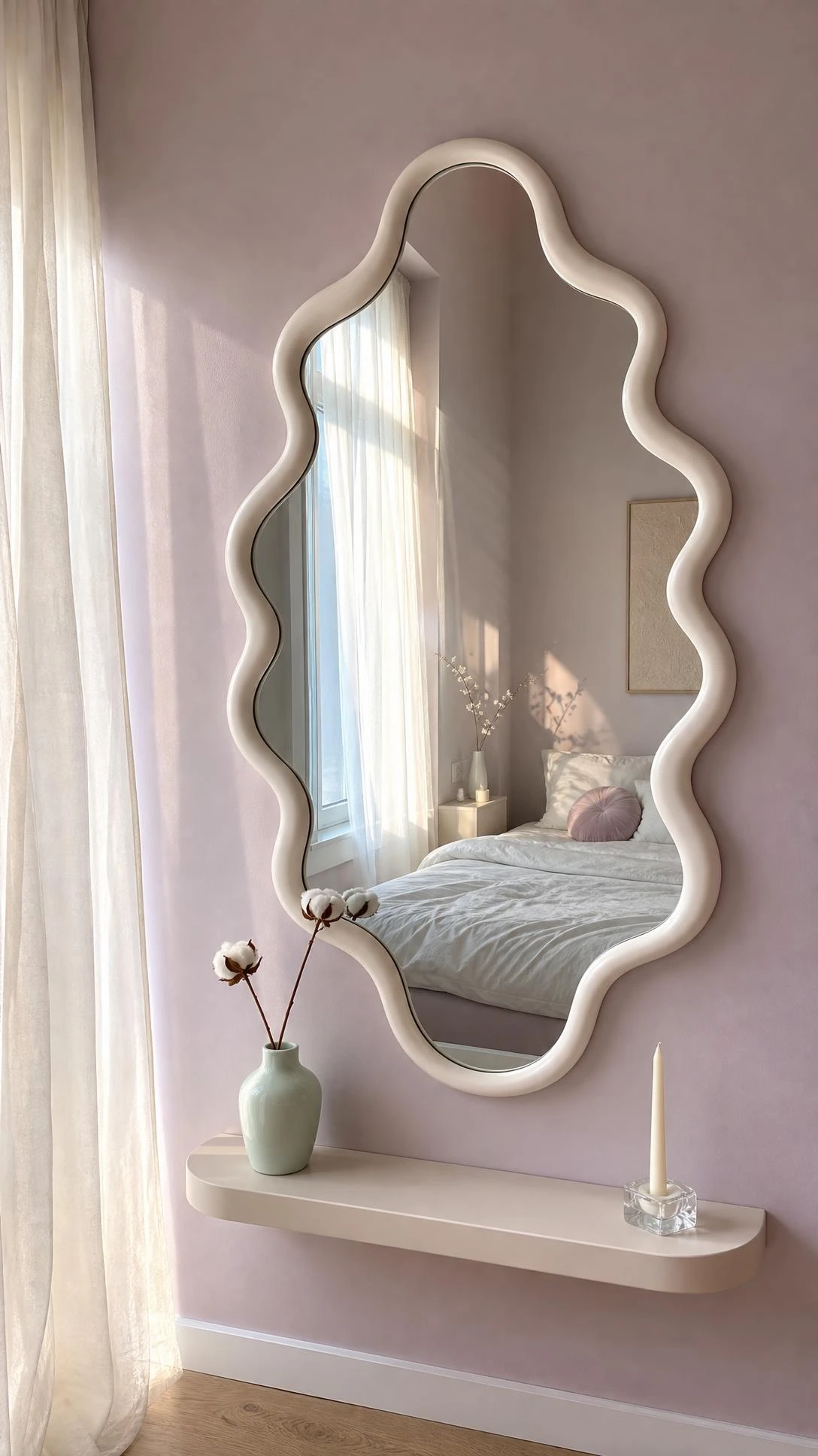
Mirrors with wavy or organic-shaped edges show up constantly in pastel room inspiration boards, and there is a good reason for it beyond just the aesthetic.
The curvy shape softens a room full of straight-lined furniture and adds a sculptural element without needing to bring in another piece of decor to fill the same visual role.
A white or cream wavy mirror hung above a dresser or leaning against a wall in a bedroom reads as playful and intentional at the same time.
Sizes around 24 to 30 inches tall tend to work best for most spaces, and options are available at Urban Outfitters, Amazon, and smaller home shops for roughly $40 to $150.
It is one of those pieces that feels like it makes the room look more considered than it actually took to put together.
8- Plants to Break Up All That Softness
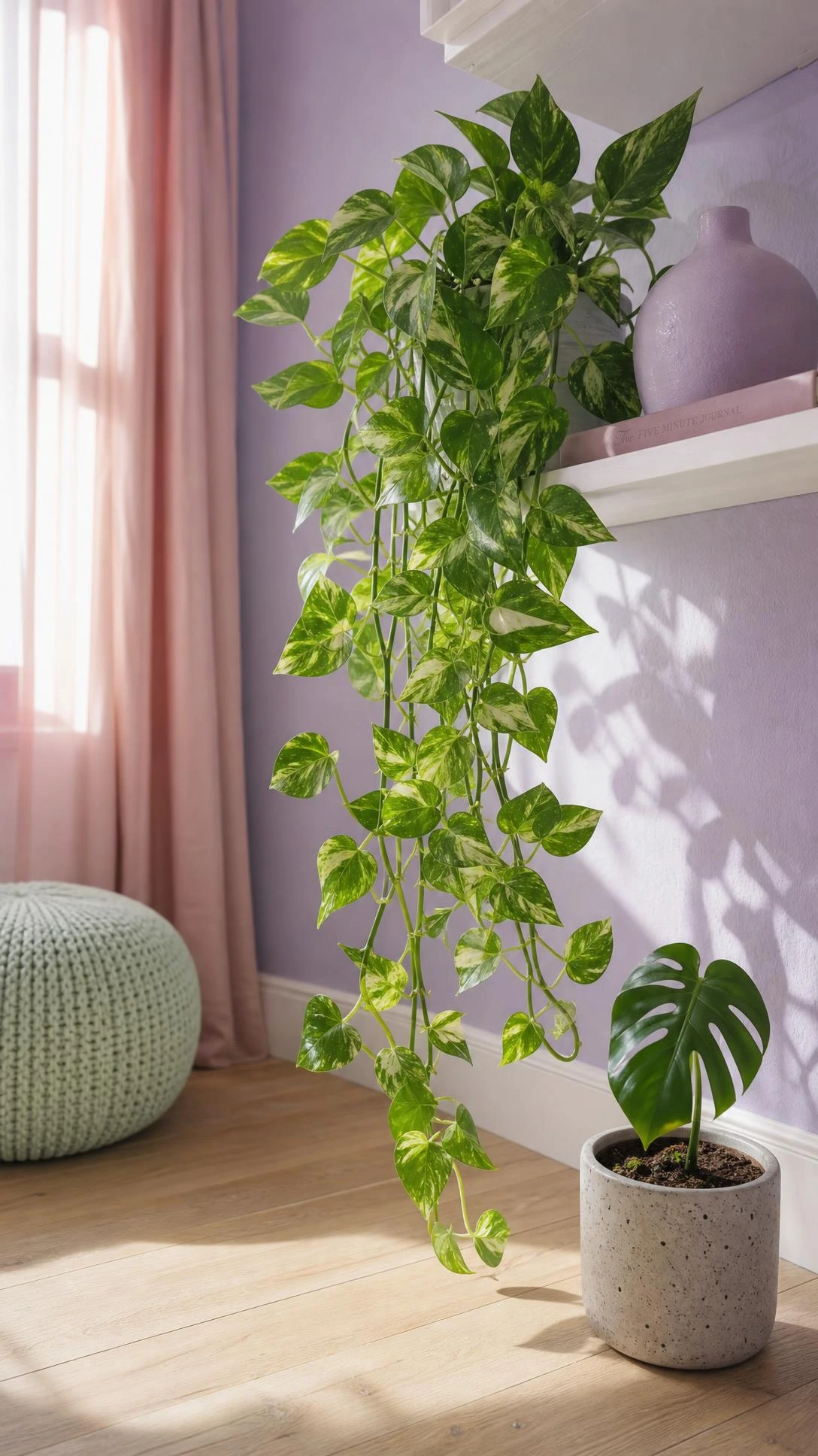
Plants in a pastel room do something that no other decor item quite does, which is add a contrast that keeps the whole space from feeling too sweet or too still.
The deep green of a pothos, a trailing string of pearls, or a compact fiddle leaf fig next to pale pink or lilac tones creates exactly the kind of visual tension that makes a room feel alive rather than curated.
People who add plants to pastel spaces usually notice the room immediately feels more grown-up and less like a theme.
A terracotta pot in a pale peach or matte white finish ties the planter into the color story without having to use a pastel pot, which can tip into being too much.
Even one or two plants in the right spots make a real difference to how balanced the overall room feels.
9- Fun-Shaped Candles and Vases as Shelf Decor
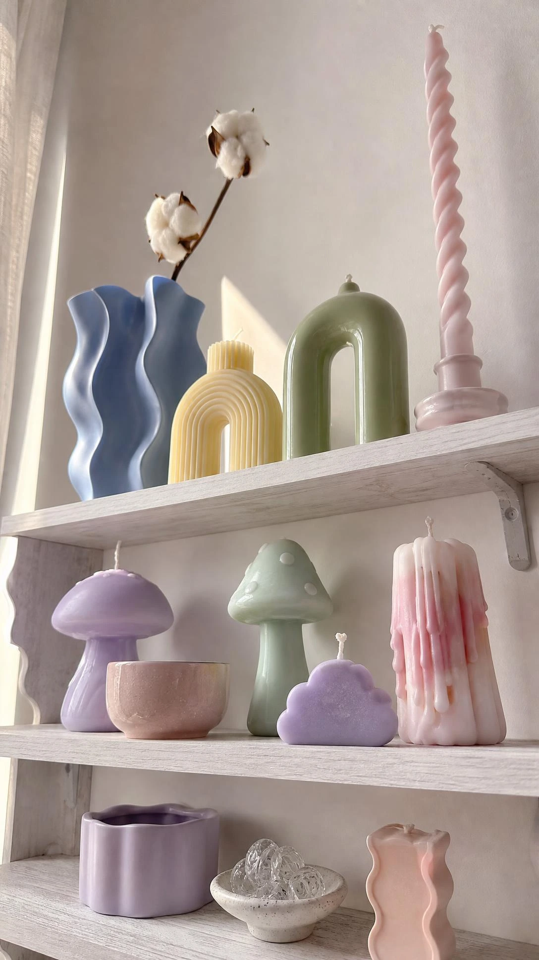
Shelf and surface styling is where the pastel aesthetic really gets to be itself, and quirky shapes go further than color alone in making a space feel playful and deliberate.
Twisted taper candles in pale lilac or butter yellow, mushroom-shaped ceramic vases, or bubble-glass bud vases in mint green add the kind of personality that flat-colored objects just do not.
The goal is just to mix a few shapes rather than line up matching objects in a row, since variety in form creates the visual rhythm that makes a shelf worth looking at.
Brands like Anthropologie, H&M Home, and small ceramics shops on Etsy are the easiest places to find these, usually in the $10 to $40 range per piece.
One or two statement pieces mixed with simpler items tends to land better than a shelf full of novelty shapes competing for attention.
10- Mixing Neutral Tones So Pastels Do Not Overwhelm
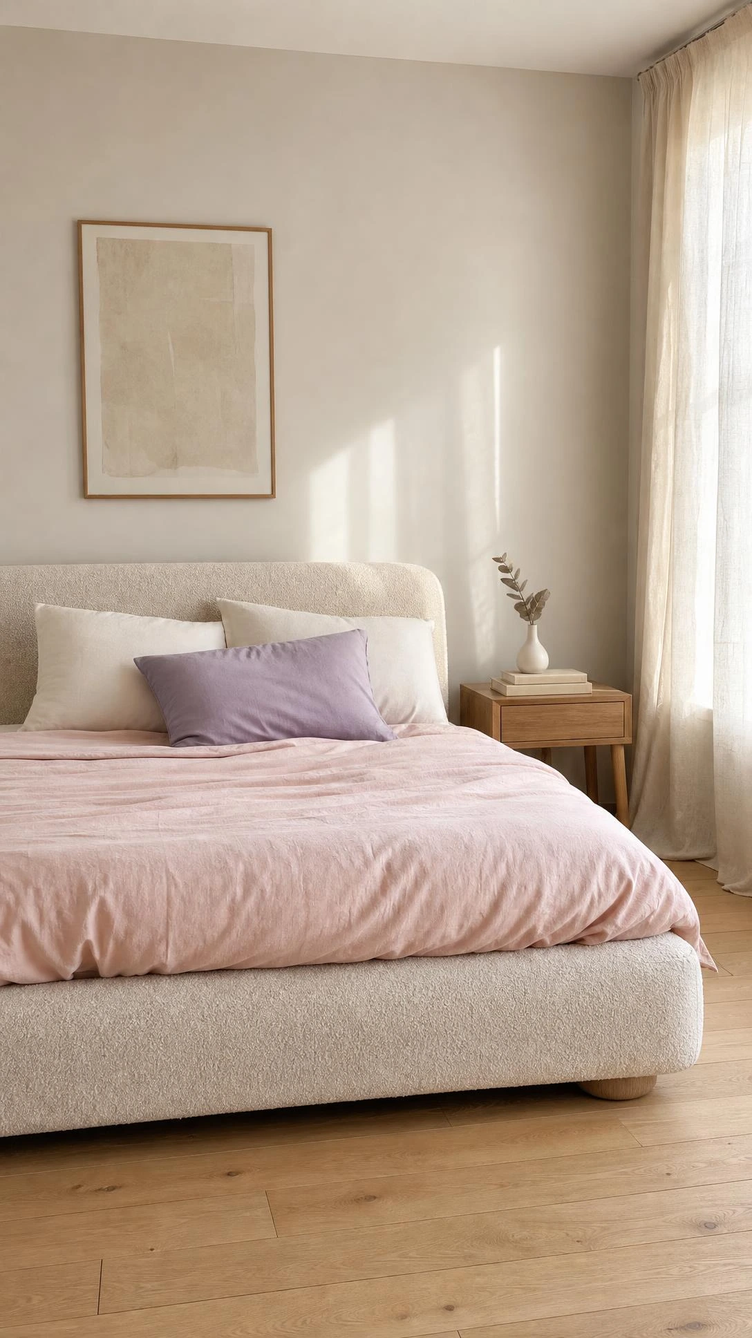
The single most common mistake with pastel room decor is using too much of it, and the fix is almost always adding more neutral to the mix.
Cream, warm white, natural linen, and light beige give the eye somewhere to rest between the color moments, so the pastels register as intentional highlights rather than a wall-to-wall palette.
A room that is roughly 60 percent neutral, 30 percent pastel, and 10 percent something with a bit more contrast, like a small dark wood element or a green plant, tends to feel balanced without looking timid about the pastel choice.
This is also the reason pastels do not date as quickly as people worry they will, because the more neutrals carry the room, the easier it is to swap out a few accessories and shift the look entirely without starting over.
The pastels stay interesting when they are not doing all the work.
A Pastel Room That Actually Feels Like Home
None of these changes require a full room overhaul, which is the part people are often relieved to hear once they get into it.
A few pillows, a rug, some prints, and one or two quirky objects on a shelf can carry the whole pastel aesthetic without the room ever feeling like a commitment.
The rooms that look the best tend to be the ones where someone started small, noticed what they liked, and just kept going from there.
Start with the one thing that feels most like you, and the rest of the room tends to follow naturally.
Hi, I’m Alizabeth, the creator of Pretty Home Hacks. I share practical home decor ideas, easy DIY projects, organization tips, and budget-friendly ways to make your home feel more beautiful and functional. From small room updates to everyday home hacks, my goal is to share approachable ideas you can actually use in your own space.